Winners of "The Extrusion Competition" - hosted by The Designated Sketcher
Recently I was invited to be on the jury for a design competition run by The Designated Sketcher. "The Extrusion Competition" asked entrants to showcase a design transition from a two dimensional sketch to a three dimensional model. After reviewing over 50 entries and having some in depth debates on the merits of each, we are pleased to announce the following winners:
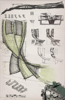
Winner: The Confluence
submitted by Drew Hastings aka DRAWHASTY
"Sited along the Willamette River in Portland, Oregon, this project is an on-going study that re-imagines the Rose Quarter and its waterfront as an engaged civic landscape in the center of the city. “The Confluence” was originally conceived as a studio project but has recently taken on a new life.
The sketches express the concept of convergence and its formal implications, which are then realized as a 3D extrusion. "


Juror Comments:
LUCAS GRAY:
What makes this project stand out is the in depth exploration visible in the sketches. It is clear that the author was experimenting with different ideas and working out the flow of spaces in both plan section and then in three dimensions. The sketches become a solid base from which the 3D model emerges. Although the design needs some development and evokes Zaha Hadid a bit too much for my liking the in depth exploration is very successful. Particularly it addresses the context - being a site along the river with various transportation types colliding, in an elegant and smooth way. The sectional sections do a great job of showing how the building interacts with various elevations and site access. It would have been nice to see another 3D image zoomed out a bit more to get more of view of how the building sits in the landscape and relates to the city.
JESSE WIDTFELDT:
The diagrams here won me over. The concept pervades through every aspect of the design; site, building plan, section, elevation. The sketching was so descriptive and effectively executed that the 3D transition could have occurred in my head without the aid of the 3D images. No elegance was lost in the 3D construction either. I can clearly read the confluence of various materials in elevation and of multiple programmatic flows section. The only short coming of this entry are those camera angles. They make me strain to see literally what I already see taking shape in my imagination. I can see that the 3D model successfully took what was examined diagrammatically but only just barely.
JEFFREY PASTVA:
I think this set of sketches is phenomenal and really sets the bar for others to strive to. Not to mention you have a very fitting title for your project, because your sketches really are a confluence of converging elements that manifest themselves in a clear manner. As you take us through your process, you clearly exhibit a magnitude of exploration, iteration, investigation, and clarity. All while doing so, you have kept an air of representation and composition about you. What I especially enjoyed, (at least this is how I read it) is that your composition and representation inherently helped you as you worked them out, and were not merely aesthetic afterthoughts. This sheet is truly a tool you used as you bounced between site section, aerial, diagrammatic parti, plan and section. Finally, you appropriate use of color is an effective method, having a clear representation goal instead of an arbitrary introduction.
Runner Up: 125 m3 Shelter
submitted by Gonzalo Carrillo de Albornoz aka GoN
"This project all started with some concept works I remembered from the first years in the university. We worked hard designing small models back then since our houses are smaller nowadays and the lack of room is a capital problem.
I recalled from that period, several models of cubic and minimalist spaces which, however, had no real purpouse -they weren't real houses-. That's how I thought it would be great if I could adapt this minimalist concept and make it useful, liveable and making the most of the space. I love the nature and the long walks and rides through the mountains, and that's how the idea of a small shelter came to my mind. The 125m3 shelter is a construction I'd love to spend a night in, overall if it was located in a stunning natural park."


Juror Comments:
LUCAS GRAY:
Again, it is the exploratory nature of the sketches that really caught my attention here. It is clear the the design was carefully analyzed and worked out in a thoughtful way before moving into the 3D realm. The architecture is simple, straight forward and yet elegant. The renderings are clear and offer a good sense of how the space will feel when occupied. For such a simple object, the proportions are incredibly important and in this case they seem to work well. The solids and voids complement each other and the material palate is simple and effective. This is a strong design that is backed up by the thought process that went into it.
JESSE WIDTFELDT:
For me this contest was all about the leap of design one takes from 2d to 3d. By that I mean the decisions that must be made when one looks at all the elements of a design interacting simultaneously which in 2d can only be explored in multiple separate drawings or not fully acknowledged. I think this entry, while simplistic in its design, is the best example of that leap occurring successfully. I can clearly see the mathematical precision with which the module is worked out in 2d, but its materiality, its internal composition, its tectonic assemblage are all worked out in that moment of 3d exploration. As the 2d diagrams tell me, the parti of the project is clear and ordered assembly of the part to the whole. I see that parti has not been lost in 3d. I see the stair shown isolated as individual steps (part) coming together to form the staircase (whole) rather than one mass. I see the louvers (part) cleverly located only to fill the entire glass enclosure of one elevation (whole). I see the wet core (part) cleverly located off center to allow for different programs around it within the small shelter (whole). Overall a very successful project.
JEFFREY PASTVA:
I think this is a fun project and one that has laid out its goals and objectives very clearly. It blends ideas of function, program, manufacturing, prototyping, size/proportional constraints all into one livable module that can be mass-produced. I also like how it has a very specific audience in mind, because it can be argued that hikers/adventurers don’t need all the amenities that a family would require.
The only thing I might argue against is that a mountain hiker generally comes from a grittier mindset than a casual tourist. In that regard, you may find that you don’t need such things as a full kitchen or even much of a bathroom. This is going to be a structure in lieu of a tent; so providing a durable shelter is an upgrade in itself.
I normally find cubic forms to be a little outdated and overdone, but I like your proportional analysis and how everything is based on a module. If this product is going to be easily reproduced, if you can fit good design into it, then that module is going to be your friend.
I find your sketches to be very informative and in your words, serve as a great design tool. A sketch is a very loose term and it all depends on where you want to go with it that will determine how successful it is. In your case, you used sketching as an analysis for determining a module. As you worked it out, you used it to break down areas and formulate more ideas based on the initial ones. The most important thing is that is shows a process of design and is clear to follow.
Third Place: Pergola
submitted by Matthew Colianni aka MATTHEWCOLIANNI
"I was in the middle of a project at the time this contest was announced. My project transformed and evolved as i created the required digital model using a handful of my favorite sketches and my research. At the end of the process I was pleasantly surprised to be nominated as a finalist and to receive so much positive feedback. Overall this competition has been a wonderful experience for me and a great introduction to The Designated Sketcher website. I will definitely be a continued user as I start my thesis project this fall."


Juror Comments:
LUCAS GRAY:
This entry was unique in that it focussed on the micro scale, delving into the details and tectonics of a simple structure. Although the design is not flashy it is well developed and perfectly fits the context. The renderings do a fantastic job of evoking the mood of the place and how this new structure would transform the space, offering some enclosure and a more intimate area. The sketches show the development of a design idea into a constructible entity. They are also some of the clearest transliterations from sketch to 3D model. I think this project does an excellent job of utilizing sketch up to create a model and then manipulating the graphics to create evocative imagery.
JESSE WIDTFELDT:
The tectonic specificity examined here far exceeded anything else presented for this contest. It took the viewer on a journey through the entire process so that one could visualize exactly how the construction would take place. It not only clearly diagramed the components but also their assembly, keeping it clear and aesthetically pleasing, which is no easy task. Where it fell short was the further study of the overall space. I would argue in fact that it was not a pergola that was designed but a corner post detail for a pergola. Had the entire design been pushed to the level of understanding as that detail I think we had a clear winner on our hands. I wanted to see a little bit more diagrammatic exploration of how the pergola interacted with its space.
JEFFREY PASTVA:
If I were playing word association with this board, the first two words that come to mind are; elegance and coherent. For starters, the concept shows a clear path from initial sketch, through investigation, and then finally into the solution. Along the way it also ends up being a well thought out and very real design. You have shown an understanding of materials, structural spans, connections, and a high level of design has been able to permeate all of them.
In addition the final solution, I am especially drawn to the sketch where you introduce the kerf to the beam end. It shows me how you were approaching a design feature and as you worked it out, it became an integral piece to the overall design. Great work and I am pleased to read that this exercise helped you to gain an understanding on some very important design issues (scale, connection, context, solar orientation).
Honorable Mention: The Fibers Between Us
submitted by DZAWKO


Juror Comments:
The project "Fibers" really pushed the boundaries of the competition and really caught our eye in terms of representation. There was a thoughtful care put into all forms of exploration and was such a unique entry we really felt it deserved special recognition. It was certainly a tough decision, but ultimately it didn't show enough process related work for us to consider it one of our top 3 spots.
Most Influential Participant: MATTHEWCOLIANNI
Juror Comments:
Matthew displayed an insatiable desire to comment on his fellow entrants work and he certainly deserved to earn the coveted prize of "Most Influential Juror". He really set himself apart and has become a go-to source for on point critique. We were especially encouraged to learn that he is still currently a student, because his breadth of knowledge was impeccable. We hope to see his continued contributions to the site and if I had a problem to solve, I would seek him out for commentary. Great job Matthew!
---
We would like to thank everyone for their participation on a very successful competition. It was an impressive field of entries and was an arduous task to select only three place winners and a runner up. If you have any feedback for us, we would love to hear it.
For more information on the competition and The Designated Sketcher check out their site: www.thedesignatedsketcher.com
a man with a van
Tweet
LUCAS GRAY:
Again, it is the exploratory nature of the sketches that really caught my attention here. It is clear the the design was carefully analyzed and worked out in a thoughtful way before moving into the 3D realm. The architecture is simple, straight forward and yet elegant. The renderings are clear and offer a good sense of how the space will feel when occupied. For such a simple object, the proportions are incredibly important and in this case they seem to work well. The solids and voids complement each other and the material palate is simple and effective. This is a strong design that is backed up by the thought process that went into it.
JESSE WIDTFELDT:
For me this contest was all about the leap of design one takes from 2d to 3d. By that I mean the decisions that must be made when one looks at all the elements of a design interacting simultaneously which in 2d can only be explored in multiple separate drawings or not fully acknowledged. I think this entry, while simplistic in its design, is the best example of that leap occurring successfully. I can clearly see the mathematical precision with which the module is worked out in 2d, but its materiality, its internal composition, its tectonic assemblage are all worked out in that moment of 3d exploration. As the 2d diagrams tell me, the parti of the project is clear and ordered assembly of the part to the whole. I see that parti has not been lost in 3d. I see the stair shown isolated as individual steps (part) coming together to form the staircase (whole) rather than one mass. I see the louvers (part) cleverly located only to fill the entire glass enclosure of one elevation (whole). I see the wet core (part) cleverly located off center to allow for different programs around it within the small shelter (whole). Overall a very successful project.
JEFFREY PASTVA:
I think this is a fun project and one that has laid out its goals and objectives very clearly. It blends ideas of function, program, manufacturing, prototyping, size/proportional constraints all into one livable module that can be mass-produced. I also like how it has a very specific audience in mind, because it can be argued that hikers/adventurers don’t need all the amenities that a family would require.
The only thing I might argue against is that a mountain hiker generally comes from a grittier mindset than a casual tourist. In that regard, you may find that you don’t need such things as a full kitchen or even much of a bathroom. This is going to be a structure in lieu of a tent; so providing a durable shelter is an upgrade in itself.
I normally find cubic forms to be a little outdated and overdone, but I like your proportional analysis and how everything is based on a module. If this product is going to be easily reproduced, if you can fit good design into it, then that module is going to be your friend.
I find your sketches to be very informative and in your words, serve as a great design tool. A sketch is a very loose term and it all depends on where you want to go with it that will determine how successful it is. In your case, you used sketching as an analysis for determining a module. As you worked it out, you used it to break down areas and formulate more ideas based on the initial ones. The most important thing is that is shows a process of design and is clear to follow.
Third Place: Pergola
submitted by Matthew Colianni aka MATTHEWCOLIANNI
"I was in the middle of a project at the time this contest was announced. My project transformed and evolved as i created the required digital model using a handful of my favorite sketches and my research. At the end of the process I was pleasantly surprised to be nominated as a finalist and to receive so much positive feedback. Overall this competition has been a wonderful experience for me and a great introduction to The Designated Sketcher website. I will definitely be a continued user as I start my thesis project this fall."


Juror Comments:
LUCAS GRAY:
This entry was unique in that it focussed on the micro scale, delving into the details and tectonics of a simple structure. Although the design is not flashy it is well developed and perfectly fits the context. The renderings do a fantastic job of evoking the mood of the place and how this new structure would transform the space, offering some enclosure and a more intimate area. The sketches show the development of a design idea into a constructible entity. They are also some of the clearest transliterations from sketch to 3D model. I think this project does an excellent job of utilizing sketch up to create a model and then manipulating the graphics to create evocative imagery.
JESSE WIDTFELDT:
The tectonic specificity examined here far exceeded anything else presented for this contest. It took the viewer on a journey through the entire process so that one could visualize exactly how the construction would take place. It not only clearly diagramed the components but also their assembly, keeping it clear and aesthetically pleasing, which is no easy task. Where it fell short was the further study of the overall space. I would argue in fact that it was not a pergola that was designed but a corner post detail for a pergola. Had the entire design been pushed to the level of understanding as that detail I think we had a clear winner on our hands. I wanted to see a little bit more diagrammatic exploration of how the pergola interacted with its space.
JEFFREY PASTVA:
If I were playing word association with this board, the first two words that come to mind are; elegance and coherent. For starters, the concept shows a clear path from initial sketch, through investigation, and then finally into the solution. Along the way it also ends up being a well thought out and very real design. You have shown an understanding of materials, structural spans, connections, and a high level of design has been able to permeate all of them.
In addition the final solution, I am especially drawn to the sketch where you introduce the kerf to the beam end. It shows me how you were approaching a design feature and as you worked it out, it became an integral piece to the overall design. Great work and I am pleased to read that this exercise helped you to gain an understanding on some very important design issues (scale, connection, context, solar orientation).
Honorable Mention: The Fibers Between Us
submitted by DZAWKO


Juror Comments:
The project "Fibers" really pushed the boundaries of the competition and really caught our eye in terms of representation. There was a thoughtful care put into all forms of exploration and was such a unique entry we really felt it deserved special recognition. It was certainly a tough decision, but ultimately it didn't show enough process related work for us to consider it one of our top 3 spots.
Most Influential Participant: MATTHEWCOLIANNI
Juror Comments:
Matthew displayed an insatiable desire to comment on his fellow entrants work and he certainly deserved to earn the coveted prize of "Most Influential Juror". He really set himself apart and has become a go-to source for on point critique. We were especially encouraged to learn that he is still currently a student, because his breadth of knowledge was impeccable. We hope to see his continued contributions to the site and if I had a problem to solve, I would seek him out for commentary. Great job Matthew!
---
We would like to thank everyone for their participation on a very successful competition. It was an impressive field of entries and was an arduous task to select only three place winners and a runner up. If you have any feedback for us, we would love to hear it.
For more information on the competition and The Designated Sketcher check out their site: www.thedesignatedsketcher.com
a man with a van
Tweet