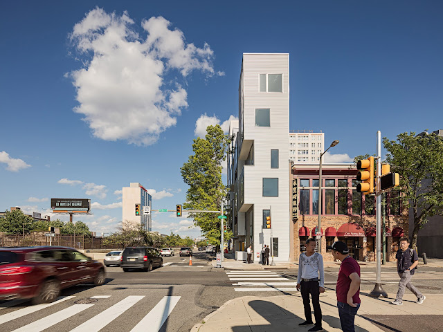
July 12, 2009
Dynamic Architecture by David Fisher
And what happens when the mechanism that spins each floors malfunctions, and we all know it eventually will. I wish there was some sort of environmental reason that would justify this design. However, the only thing I can come up with is the fact that Dubai is swamped with money and needs new shiny toys to build. That being said there is also a similar design proposed for Moscow, another oil rich country - well at least until the recent economic collapse.
The idea of dynamic elements in architecture is wonderful and certainly not new. The simple elegance of the installation by Ned Kahn, featured previously on this site, is a perfect example of a low tech dynamic design that brings new meaning to a building and illuminates the complexities of our natural world. In my eyes this is a much more powerful and elegant concept.
July 10, 2009
Museum Plaza Proposal by OMA
July 4, 2009
The High Line: and the Spectacular Rebirth of Public Space in New York
The ironic dilemma with New York City is that, even as it boasts one of the densest metropolitan populations in America, ideal public space is virtually non-existent. No grand pedestrian boulevards dissect the Cartesian grid. Only a few remarkable plazas dot the island. It’s as if the city assumed that the transplantation of a Central Park into Manhattan would provide enough public space to last the rest of the city’s history. As Manhattan has seen glamorous and self-indulgent architectural marvels rise against its fantastic horizon in recent years, the darkness these buildings cast upon the pedestrian streets seemed to signal the very disappearance of designed public space. The lack of great public space in New York appeared endemic. But then came the High Line. One of the most ambitious public projects in the modern history of New York, the High Line is a bold testament that, given the opportunity, Manhattan has the potential to create fantastic and poetic public spaces.A horizontal beacon of life in a vertical landscape of desperation and anxiety, the High line is a spectacle for the senses. As it meanders through the urban fabric, it superimposes the existing static infrastructure with dynamic spaces for leisure. Conceived as an elevated park and designed by James Corner Field Operations with Diller Scofidio + Renfro, the High Line takes as its nucleus the abandoned elevated tracks that run from the Meatpacking District thru Chelsea and into Clinton Hill.
The tracks were built in the 1930s as a means to remove dangerous freight traffic from the pedestrian level. As part of the West Side Improvement project, the tracks stood lifeless since 1980. Often, the tracks acted like portals into the spectacle of the Chelsea gallery walks. The project will be completed in phases, with the next and last section to open in 2010. The idealized flow has the user exploring from South to North. At a conceptual level, this becomes a precious necklace dotted with extravagant gems, a clearly executed architectural promenade, degenerating and reintegrating along its journey and ours.And so the journey into this densely stratified urban experience begins. Ascending into the park from the southernmost point of the project is the first of many poetic moments. The sky, along with the new Standard Hotel, is framed by the stair opening and flanked by panels of glass that retain swatches of green. A beautiful moment occurs at a certain point in the ascent, as the visitor’s eyes meet the level of the park floor, perpetually calling attention to the plantings peering through the pavers. At the top of the stairs, the visitor is released back into that city - immediately we are reminded that this project, first and foremost, is a park in a city.
Throughout the park, a vast array of green hues subtle colors emerge from the railroad tracks. Grasses. Shrubs. Plants. Flowers. By design, the transplantations appear as if they have been growing naturally for decades; in fact, plants had already rooted themselves above the abandoned tracks and this was the source of inspiration for this landscape design. Though these new greens seem wild, upon closer inspection one notices that they are carefully curated in clusters. An orchestrated opera of textures and colors that rise above the intelligently designed pavers. Made of concrete, these pavers are wonderfully sculpted to maintain the scheme of a ribbon weaving its way through the landscape. Though the majority of the pavers are simply elongated rectangles, there are those that dive back into the tracks, bulging then tapering, easing the boundaries between walkway and plant way. Sometimes they rise and transform into playful, cascading water fountains. Other times, they emerge from the floor, mate with wood and morph into benches. These seating elements both invite and repel. They invite repose, offering a static immersion with the surroundings. Sensational views. Random aromas. Eccentric textures. In their fluid manifestations, they also repel as they promote movement, progression - becoming directive markers on a path to urban salvation, micro-beacons across the sea of concrete and grasses.
As the High Line subtly transforms as it unfolds, so do the surroundings. Historic warehouses. Glass and steel towers. Brick boxes. Extravagant perspectives. Parking lots. A river. Office windows. A hodge-podge of decent and bland architecture, the surroundings mostly sit static at the sidelines, often they recede in the distance and select few collaborate in this metropolitan experience. Indeed, the collection of buildings that line the High Line are of peculiar interest. There is Gehry and Ban and Nouvel to name a few of the most recognizable. Planned in tandem with the High line, the Standard Hotel provides the first moment of compression. Walking through this urban tunnel is sensational as these moments of imagined enclosure accentuate the experience of the promenade.One of the most playful spaces in the project is a linear area of wooden daybeds that face toward the Hudson River. They create a space that, although in the middle of a bustling metropolis, is also calm and serene. New Yorkers have already declared this a space for reading, gawking and napping. Immediately following this space of repose is another urban tunnel. With a few tables and chairs scattered about, and a mosaic of blue and green-hued glass panels to one side, it is a strangely romantic place. With allusions to theater and ritual, it's a modern day interpretation of a classical Gothic place, stained glass window included. Further along, the visitor finds another space dedicated to the ritual of spectacle. A series of benches descend below the tracks, culminating in the spectacle on view- the street! Framed in glass, strokes of
yellow cabs that disappear into the distant street were on view during one visit. At the end of the project is a set of stairs that ascend and cross over the the original railroad track edge, creating a bridge, a ceremonial platform that allows one to gaze back at this unique experience of urbanity before being released back into the street level below.Looking back one wonders what New York would be without this vital transformation. One is reminded of the tale by Borges as told by Jean Baudrillard, of the myth where a map of the city is drawn so detailed that when it is laid on top of the actual city, it covers exactly the same area. Over time, the map withers, and the remaining pieces merge with the real. There no longer is any distinction between the map and the real and the High Line has this sort of metaphysical beauty. The distinction between what was existing and what was actually designed is indiscernible. The project seems to have grown naturally out of its own abandonment. And that vision is what makes this project so poetic. A ribbon that weaves through the urban fabric, its threads often disintegrating with actualities and its strands rethreading with illusions. The High Line is one of the most poetic and beautiful public spaces in the city’s modern history. It has given back to New York THE grand stage where New Yorkers can be…well, New Yorkers. Give us space and we will use it. Exponentially.
June 27, 2009
The Art of Ned Kahn
June 21, 2009
Milton Glaser on using design to make ideas new
June 5, 2009
Building A Future: Mapping, Molding and Measuring Educational Success Through Architecture
A scale model of the neighborhood east of Berlin's iconic TV tower was recently conceived by the Year 1 class at Berlin Kids International School (BKIS). Doused in vibrant colors and with new buildings sprouting from the children's imagination, this model represents the dreams of our future architects, designers, and politicians. The Junior Architects Project conceived by Jessica Waldera, founder of Kleine Baumeister in collaboration with the AEDES Junior Campus Workshop was a unique opportunity for 6 and 7 year olds to engage their built environment. The ultimate goal was to build a 3D model of the school and it's surroundings; in the process they achieved much more. This was truly a cross curricular project, where the children applied math skills, had geography lessons, discovered the science of mixing colors, and learned valuable lessons in team work.The Architecture Forum AEDES is uniquely focused on exposing architecture and urban design through the local and global community. This international association, who runs a gallery and holds workshops for university students, generously donated their facilities and supplies for the children to engage in the creative rethinking of their school's neighborhood.
This project was the culmination of a larger “building” theme at school, where the children at BKIS had been learning about iconic structures around the world, including Berlin, and the elements of architectural design. Equipped with basic knowledge of construction materials, structure and building features, they were eager to apply their junior architectural skills. This exploration into the world of design began with the children analyzing various chairs around the school and discussing their peculiarities and purpose. Using these observational techniques, they embarked on a local scavenger hunt where they photographed their environment, sketched buildings, counted windows, measured car lengths, read street names, took note of colors, shapes and sizes, and democratically decided how to spend 3€ on a sweet treat for 9 people.Next the students were given maps of the city, the country and the continent, which they intently and industriously examined. With the help of their teachers and a street index, they found their homes on a large map of Berlin and marked it with a pin and ribbon measuring the distance to BKIS. Surrounding this chart, which is now a permanent fixture in the classroom, are drawings of the students' homes and their own visionary portrayals indicating their route to and from school. This taught not only map reading skills but also gave the children an understanding of context in relation to the urban environment.
This led up to 3 intensive days at the AEDES campus, where the children were able to explore the current exhibit and make use of the studio space. Working mostly at stations and in small groups, the tasks were laid out in a fashion that allowed the children to work freely and at their own pace. On one large table was an enlarged scale map of the area surrounding Berlin Kids International School. Here each child used tracing paper to contour an existing building they wanted to model. They took this outline, cut it out and pinned it to a piece of polystyrene which they then took to the hot wire cutter - the most exciting part of the process. At this station, which was the only one constantly monitored by an adult, the children used the tool to carve out their building, sometimes doing it twice in order to more accurately represent the scale of their structure.The next step was coloring their replicas. Some children used pictures that they had taken earlier in the week to guide them in painting a semi accurate representation but most of them just adorned their models in a color they thought to be appropriate with the attitude that “anyone can leave a building white, only we can make it colorful”. As adults and educators, we had to step back and suspend our conventional preconceptions, allowing the children to be masters of their design.
Finally, paper roads were painted, polystyrene trees were planted and water fountains were given life on the model. The climax of the week was a vernissage of sorts in which reporters, parents and peers were present to bask in the children's vision of our future metropolis. The students presented the result of their hard work - including the older classes who created a newspaper of the project, documenting interviews they conducted as well as stories and poems inspired by architecture and the city. The finished model will now be permanently displayed at BKIS.
Normally children do not find themselves in a workspace containing pristine white walls, high ceilings and designer chairs, so all tolled their conduct in such circumstances was very commendable. They worked with professionalism, pride and proficiency, and despite longer than normal work days, were cheerful and energetic as always. It was amazing to watch the children concentrate so hard when given the responsibility to use the wire cutter or discuss how best to represent their neighborhood.
The significance of a project like this should not be underestimated. The children were able to apply what they learn in the classroom to something very real. They understood why they need to measure or count, why communicating ideas is so valuable and how vital team work is. Moreover, they were able to apply their own special skills and expertise, that do not necessarily emerge in the classroom. The theory of multiple intelligence is truly applied in an activity like this and highlights the advantage of project-based learning in schools. It also gave the students an opportunity to express their creative sides and comment on the state of our built environment. Often architects and elected officials get it into their heads that they know what the best vision for a city is. When offered the opportunity this class of first graders completely re-imagined the city in which they live and gave it a vibrancy lacking in so many cities today.
May 28, 2009
OMA's Joshua Prince-Ramus on Seattle's Public Library
May 26, 2009
William McDonough on Cradle to Cradle Design
Either way you can't argue that his ideas should be ignored or that his buildings aren't trying to make a better place for us to live and work. In this talk he goes over his philosophy of design and ends up highlighting a design his office did for a new city in China.
Enjoy the video and I promise to post a new article in the near future. I also have some more videos to post and a show from the BBC on Meis van der Rohe coming soon.
April 24, 2009
Moshe Safdie: What makes a building unique?
April 13, 2009
Peter Zumthor wins the 2009 Pritzer Prize
Notable Buildings:
Museum Kolumba - Cologn, Germany (2007)
The Brother Klaus Field Chapel - Mechernich, Germany (2007)
Swiss Pavilion - Expo Hanover, Germany (2002)
The Kunsthaus Bregenz - Austria (1997)
Thermal Baths - Vals, Switzerland (1996)
St. Benedict's Chapel - Sumvitg, Switzerland(1989)
April 5, 2009
Cameron Sinclair: Open-source architecture to house the world
"Accepting his 2006 TED Prize, Cameron Sinclair demonstrates how passionate designers and
architects can respond to world housing crises. He unveils his TED Prize wish for a network to
improve global living standards through collaborative design."
The Transportation and Livability Group (LiveMove)
Liz Diller: Architecture is a special effects machine
designers and inspiring people discussing issues facing our built environment. I hope for these
short movies to compliment the written articles and add a new platform to encourage debate.
Please leave your thoughts, opinions or suggestions in the comments section!
March 17, 2009
Low Tech Design Emerges in Berlin
This Article was written for MySpace Design Magazine
With so much focus on high tech solutions these days its refreshing to see some elegantly simple designs utilizing low tech approaches. Germany is commonly known for its precise engineering and technological advances in the building industry. Contemporary architecture throughout the country utilizes high-tech solutions to satisfy issues of structure, envelope, materiality and address sustainability. Computer manipulated louvers, rotating sun screens and advanced materials are common among the contemporary buildings in Berlin. However, technology doesn't always lead to great design. In a city renowned for its economic hardships going hand in hand with a thriving art scene, budget constraints can lead to true innovation and creative design solutions. Berlin's reputation stems from the fact it is affordable to live here giving artists the freedom to live a bohemian lifestyle and pursue their creative endeavors.
This inspirational environment has spilled over to the fields of architecture and design as. Two projects in particular demonstrate the creative power of design utilizing low-tech solutions. The Chapel of Reconciliation utilizes rammed earth – one of the world's oldest building materials and techniques – while the Camper store creatively makes use of something as simple as the shoe box.
Camper, the Barcelona based shoe company is known for creating high quality coverings for our feet. Beautifully simple in design and using high quality materials has lead to a world renowned reputation. Their store designs have always followed suit – utilizing simple and common materials in new and creative ways. Each store is distinctively different while maintaining a close connection to the brand identity. By keeping the interiors simple it places the shoes front and center as the focal point for all customers - letting the product do the talking while the store becomes a complimentary backdrop.
“Camper shoes have always been shoes that are distinguished by their comfort, their technology, their respect for tradition... and at the same time, the imagination of their design.” In the Berlin store, located on Neue Schönhauser Straße in Mitte, the designers originally developed a concept for a temporary retail space called “Walk in Progress”. They stripped the space down to the bones, white washed the walls while keeping the old wood floor. A simple wooden plank is angled down the center of the space supported by stacks of the iconic Camper shoe boxes, making a bench. Each wall has a similar dark wooden table about a meter deep showcasing the range of styles of shoes – mens to the left, womens to the right. Again these tables are supported by stacked shoe boxes. This concept has the packaging of the product becoming an integral part of the architecture of the store – a structural element of the displays.
The walls have slowly morphed from a clean white surface to a collage of signatures and messages left in red marker by the thousands of shoppers over the past few years. Using the brand's primary color is another simple and playful design idea that gives the customers a voice in the brand's architecture. This idea opens a dialogue between the brand, the store and the customers. The concept has become so loved that the temporary tag has been removed and this design remains as the permanent store.
- - -
The Chapel of Reconciliation was a politically sensitive project, replacing a large brick church that was destroyed in 1985 because it stood in the zone between the walls. The sensitive resolution is a small elegant chapel built of wood and rammed earth. It doesn't have any insulation and relies on daylight to illuminate the chapel. The plan consists of two ovals one inside the other creating a layered building. This concept is reinforced by the use of natural materials. The outer wall consists of vertical wood planks spanning from the cantilevered roof to the floor slab. Spaced about 6 inches apart they form a unifying facade as well as become a screen that gently reveals the heart of the church inside. There is nothing thermally enclosing the gap between planks which also reinforces a connection between the congregation and the surrounding community and environment. Air freely flows in and out and sunlight casts strong shadows across that streak across the floor and sharply bend up the heavy walls inside.
The inner oval has a slightly shifted axis that aligns with the plan of the previous church. The heavy rammed earth walls also include fragments of the original bricks in the soil mixture. This creates a literal and symbolic connection between the new structure and the historic context of the site. The original altar has also been recovered and reinstalled in an alcove within the rammed earth walls where it originally stood in the previous building. This prayer room relies on a single skylight to illuminate the space. Lighting conditions change as the weather, climate and seasons make their rounds again connecting spirituality with natural forces. There is nothing fancy about this building. It is incredibly simple yet profound in its materiality, symbolism and meaning to its congregation.
Complexity in architecture too often takes precedent over clear concepts and simple execution of creative designs solutions. These projects aren't breaking any ground when it comes to technological innovation. Yet they are both simple to the point of being remarkable. The Camper store playfully utilizes an iconic part of purchasing shoes and morphs it into an integral part of the interior design. The Chapel of Reconciliation on the other hand looks into the past for an ancient technology and gives it a rebirth in todays high tech design world. Both are incredible creative and offers a new approach to contemporary architecture.
February 15, 2009
The Reichstag
By Lucas Gray
A monument of Germany's past has been given a new life in the redesigned Reichstag. First opened in 1894 the Reichstag was built to house the parliament of the German Empire. It stood as a symbol of democracy for close to forty years until communist arsonists severely damaged the structure in 1933. Throughout World War II and up until the reunification of Germany in the late 1980s it sat as an empty shell - a symbol of a nation that had been torn apart by war and politics. It was here that the official reunification ceremony was held as it sits along the former border between East and West Berlin. When Germany’s government was moved to Berlin from Bonn in the early 1990s the Reichstag was returned to prominence and once again became the home of Parliament and the symbol of German Democracy.
An extensive renovation project preserved the historic shell of the building while using high tech systems to bring the building up to date and make it more environmentally sustainable. An international design competition was held and ultimately won by internationally renowned British architect Norman Foster. The entire building has been retrofitted with all interior walls and floors removed and then redesigned. Only the exterior facades were preserved. Internal court yards bring natural light deep into the building and provide natural ventilation.The dominant aesthetic feature is the large glass cupola that rises above the heavy stone walls. It was not part of the original competition scheme but was added to reference the dome that used to sit atop the building. It features a complex system of louvers, screens and reflectors that bring natural light streaming down into the parliament chambers. The dome is open to the public, becoming a symbol to the openness and transparency of the new German Democracy. The entire rooftop has been transformed into an observation platform overlooking the city of Berlin.
A spiraling ramp twists around the glass dome providing spectacular views of the city and an ever-changing perspective of the stunning mirrored reflector. Fragmented views of the surroundings, fellow visitors, and the sun create a mosaic effect on this object dominating the space. A large carefully calculated sunscreen tracks the sun and prevents overheating and intense direct sunlight from disturbing the inhabitants below.Thousands of visitors wait for hours to get a chance to visit this gem of contemporary design. It has become one of Berlin’s most visited attractions and continues to draw large crowds, even ten years after completion. Although it has seen its share of criticism it has ultimately been a great success and has grown into a wonderful symbol of the German government and the city of Berlin. It is a great example of how architecture can become something greater than a mere utilitarian building and provide meaning and pride to an entire nation.
January 19, 2009
Webcasting to a Global Classroom
by Lucas Gray
Traditional education has revolved around a group of people gathered together in a single place to listen to a respected elder talk about their expertise. Whether it be an aboriginal tribe chief sharing traditions and heritage through fables, or an esteemed university professor lecturing about Post-modern American literature, for thousands of years this has been the model humans have used to disseminate information. Architecture has played a fundamental role in this traditional educational model. In today’s world buildings are the places of meeting and interacting at our educational institutions. Where once this was an advantage - bringing great minds and diversity together - it has become a limiting factor given our acclimation to worldwide communication with new technology.
Internet has revolutionized the way we access information and communicate with others. Technology is still being tested and adapted to best serve our educational institutions. Professors have slowly started using digital media in the classroom but not in such a way as to match the pace of technological advance. Administrators still question and struggle with how best to utilize and invest in new technology. However, as it slowly becomes more prevalent throughout the educational system the Internet and webcasts can reinvigorate what has become dry and dated.
A couple of years ago I was lucky enough to be studying for my Master of Architecture degree at the University of Oregon when a group of architects, environmentalists and designers concerned with Climate Change held a unique event called The 2010 Imperative Global Emergency Teach-In. Over a quarter of a million people from 47 different countries gathered together on February 20th 2007 to participate in this revolutionary educational event - an interactive webcast where Climate Crisis and Design experts addressed an audience spread throughout world. The event preached the urgency of action and offered strategies to accomplish the goals needed to curb carbon emissions. To see a list of participants click here.
At the University of Oregon School of Architecture, students were huddled around televisions in the corridors, crowded into lecture rooms, stared at laptops at their desks and made impromptu lecture halls with projectors in stairwells. Video cameras were set up for students to ask questions to the speakers and interact with other participants around the world. It became an environment that encouraged dialogue between students and professors, students and their peers, professors and each other, and really tore down the walls of the traditional educational model. No longer was there a single solemn professor standing in front of, and talking at a group of half-asleep students. No longer was it even necessary for students to be in the same room. Instead it became a worldwide conversation - a sharing of ideas. Most importantly, it enabled anyone and everyone who is interested in the topic to tune in. It offered free information to everyone who was willing to listen and learn.
One of the unique aspects of this model of education is the interactive capability it provides. Competitions, workshops, and games were introduced at the 2010 Imperative event, which called for students to make short films, art projects, or essays to post on the website. This allowed the content and the message of the event to spread even more, incorporating the ideas of the thousands of participants. No longer was I learning the knowledge of one individual and his/her point of view but rather I had access to the thoughts, ideas and experiences of people from varying backgrounds, cultures, and climates. New points of view were brought up that our school might not have addressed due to its geographic location or socio economic condition.
When an event allows individual participants to add their input, there tends to be a breakdown in the review process to verify facts within each contribution. A professor has been hired because of his educational background and research work. Hopefully this qualifies him or her to teach their subject matter. This is not the case with user-generated content in a web cast situation. This particular event focused on a series of lectures by experts in the field and then allowed for questions and comments directed to those lecturers. In this particular scenario the additional content was secondary in importance to the primary speakers, which allowed for the well-researched message to come to the forefront. However, this may not always be the case with other Internet based platforms. Web casting may democratize information and education but may also dilute important messages with uninformed opinions.
This event opened my eyes to a new way of education; offering focused events and letting all interested people participate in an interactive way. No longer will education be reserved for those who can afford it. Coupled with the One Laptop Per Child initiative, education and information can be made readily available to all. The advantage lies in the fact that the knowledge available will also have all of humanity contributing to it. The information will evolve and grow to account for differing viewpoints and experience. It will allow students in Oregon to learn about environmental issues in Nepal and ask questions to and collaborate with students living and studying there. The opportunities are endless and outweigh the possible pitfalls of using the web to educate.
The 2010 Imperative Global Emergency Teach-In was a spectacular event that has grown into a movement to create change in the world. It was focused on influencing people to change their habits, lifestyles, and building practices to address the growing concern of Climate Change. However, it may also have revolutionized the way information is disseminated to people throughout the world – how technology can forever change humanity’s educational model and perhaps the architecture of our educational institutions.
January 13, 2009
The Jewish Museum
By Lucas Gray
The Jewish Museum in Berlin exploded onto the international architecture scene in 2001 with great fanfare. A truly unique design by Daniel Libeskind - the jagged volume cut by jarring windows is said to allude to the struggles and hardships the Jewish people have overcome throughout a troubled history. The design evolved from a deconstruction of the Star of David slowly evolving into its present form. This symbolic shape was disassembled and morphed into a long meandering building that bends and folds back off of the main street into a tranquil garden. It has an extreme contrast to the historic building it extends from and is an eye catching form that attracts visitors as much for the architecture as for the museum's content.
The exterior is truly captivating. The metal cladding has ever evolving moods as it reflects hues from the sky and surroundings. At dusk, the walls turn subtle pinks and oranges that contrast against the dark gray of the planes that face away from the setting sun. As the building twists and turns small courtyards emerge housing symbolic gardens or hard-scaped plazas. Wandering around the structure gives the visitor an ever-changing ambiance with tight sharp spaces adjacent to open airy gardens.However, this bold statement as a piece of sculpture in the landscape loses credibility when seen from within. As a museum this building is a terrible disappointment. From the questionable curation, the quality and interest of the exhibits, to the confusing procession, the interior is rather poorly done. As you descend a dark yet beautiful staircase to enter the first exhibit space you expect to emerge in an interior that reflects the beauty and complexity of the exterior. Instead you are left feeling flat as a long straight corridor lit with fluorescent lights opens before you. Small exhibits and artifacts relating to the holocaust are inset into the gypsum board walls. The content and stories being told deserve to be celebrated in a more elegant space than currently exists. The materials feel cheap, the detailing is poorly done, and the lighting is atrocious. As was pointed out to me, Libeskind didn't design the exhibits. However, he was still responsible for choices of materials and detailing which fell short in my opinion.
A glimmer of hope arises as you move up another grand staircase that brings you to the start of the main exhibition space. Flying concrete beams pierce the three-story space above you and generate dramatic shadows and a feeling of intense movement. Looking back down after the hard climb offers an intriguing view of a unique architectural space. But the fact that it revolves around a 3 story climb up stairs limits its effect as many visitors just can’t physically accomplish it. It creates a terrible social injustice, especially with an increasing elderly Jewish population.Once you do enter the exhibits you find kitschy displays, rather uninteresting artifacts and a space that is unemotional, unmoving, and rather unattractive. Its confusing as how to move through the exhibit, the lighting is terrible, and the small slashes of windows don’t let in natural light, don’t let out good views and reveal more poor detailing. More whitewashed gypsum board walls move you through the interior that is an ultimately forgetful experience.
Now I would be ready to give the architect Mr. Libeskind the benefit of the doubt. He was attempting to create a bold, unique form that symbolically related to a very touch history – especially here in Germany. However, since completion of this museum he has gone on too use the same jagged planes, slashed windows, and bland materials on dozens of projects since. I feel this takes away from the symbolism offered as an explanation for this outlandish form. From the Denver Art Museum, to the Royal Ontario Museum in Toronto, to the Contemporary Jewish Museum in San Francisco, Daniel Libeskind has created overly complex geometries without actually making great architecture. He has spent millions of taxpayers’ dollars without giving the people a building that will stand the test of time and become a symbol of their city’s culture.
January 11, 2009
Landscape Informing Design: the Architecture of Antoine Predock
“The concept of architecture as analogous to landscape is something that has interested me for a long time.”Historically speaking the land has had a predominant influence over the architecture of a given culture. Availability of building materials as well as climate dictated designs. Landforms and other natural elements often influenced designs because of the advantages they gave for defending land, cultivating land, as well as often having religious connotations. However, because of technological advances we don’t have to worry about many of these issues in the developed world. Defense and agriculture aren’t major issues influencing the design of our buildings anymore, and even fundamental problems such as weather and climate aren’t addressed today as they were in the past because of technological advances in air conditioning, heating and other forms of climate control. Still, contemporary architects need to draw on something as inspiration for their designs and often they turn back to the landscape.
– Antoine Predock
Contemporary materials and technology do play a major part in the design process but ultimately architecture remains influenced by the same forces as it has for thousands of years. The mountains and deserts of the southwestern United States as well as other major geographic elements like the Pacific Ocean, the sky, local waterways, local wildlife, and the desert play a significant role in the development of Antoine Predock’s buildings
Before beginning his designs, Predock constructs large collages that conjure up images relating to the site and explore connections to local history and geography. Often his designs take on forms that are clearly inspired by features of the surrounding landscape - such as mountain ranges in the distance, the Pacific Ocean, forests, streams, the desert or other natural phenomena that surround his sites. For Predock, landscape is not something just to gaze upon. It is a great deal more than simply a collection of views. His collages consist of photographs, postcards, rocks, plants, animal skeletons – anything found on or around the site that conjures the spirit of the place. He believes that each site is timeless. Everything from the past and present, from folklore to contemporary technology is included as possible influences on the forms his designs may take.
Four projects demonstrate how Antoine Predock has taken different approaches as he works in varying Landscapes. The American Heritage Center in Laramie, Wyoming responds to the large flat valleys and distant mountains. The Ventana Vista Elementary School in Tucson, Arizona demonstrates Predock’s response to the American dessert. The Turtle Creek House outside of Dallas, Texas shows his response to the deep south and how he incorporates his buildings into woodlands and streams. And finally the Venice House outside of Los Angeles, California demonstrates the relationship between his building, the nearby ocean and the surrounding urban context. These four projects all have vastly different climates and terrains. Antoine Predock successfully drew from the surroundings to create responsive designs to all four unique landscapes.
The American Heritage Center, Laramie, Wyoming
This design is viewed by Predock as an “archival mountain with a village at its foot.” The building’s axis lines up with the two highest visible mountain peaks - Medicine Bow Peak, in the Snowy range, and Pilot’s Knob, part of the Laramie range. This axis marks an historical rendezvous point for Native Americans as well as a for French trappers and early American settlers. Now it has become a place of intellectual and social rendezvous. Whenever Predock designs, he addresses the larger natural and mythic context and content of a site and program.A web of site-specific alignments anchors the building into the campus and the immediate landscape. The complex consists of a main building in the shape of a large cone with block like surrounding buildings. This become an abstract representation of a mountain with a small village at its base. The buildings at the base are long terraced flat roof buildings. These structures are meant to recall the architecture of the pueblo Indians. The cone is a mountain, standing alone in a sweeping vista framed in the distance by two mountain ranges. Like ancient temples this structure contains a symbolic significance in its form and orientation.
Predock always weds the symbolic forms of his buildings with the practical and useable aspect of design. This site is in the center of a wide valley between two mountain ranges that channels wind. To protects his building from these wind forces he designed the block buildings as long and low structures that are protected by the cone and a wall of trees. The cone itself is detailed like an airplane wing to be aerodynamic. Openings in the cone are kept as small, deep and limited. The top of the cone is an observation deck and a chimney - releasing smoke from the giant hearth that makes up the central shaft of the cone. From a distance the place looks like a strange volcano spewing smoke into the night sky.Ventana Vista Elementary School, Tucson, Arizona:
Located near the Catalina Mountains and the Sonoran desert, the School consists of small courts and pathways that are arranged around the two-story library building. The skyline of this school is designed to have a clear reference to that of the mountain range behind it. This "city for children" suggests ageless ruins, thought of by Predock as a direct confrontation with the inhospitable environment of the southwest desert.Although the architecture is sometimes criticized as stark, Predock argues that the desert is about power and loneliness and thus the building should not be cute. The entire complex is designed at a scale designed specifically for the ages of children occupying it. Predock designed the school to be built on many different levels that corresponded to the topography of the site. Each level became a “neighborhood that was part of the overall city for children”
There is a tent-like white canvas structure that makes reference to the nomadic occupation of the desert. A “Solstice Wall” contains openings of various angles and shapes allowing sunlight to penetrate it on specific days – such as Cinco de Mayo or the Winter Solstice. As light pours through, it highlights plaques embedded in the ground that make reference to historical events. This feature of the architecture allows students to be constantly aware of the passing of time and the sun becomes a teaching tool. These features are a direct result of the influence on the social history of the site as well as the specific environmental conditions. The apertures also frame specific views of the landscape making the wall both an observatory and a beacon.The actual classrooms and activity rooms are all separate buildings. Each building has its own function. There is a structure for each grade level and two large buildings which house the library - in the center of the site - and the Activities center - with the canvas tent covering it. The courts and paths created by the voids between these structures become one of the most significant parts of this design. Each open space focuses on a different form of discovery. They each focus on important learning activities such as vegetable gardens or places for animals. Unique and fun design features are introduced - spy holes into classrooms, the Solstice Wall - and create distinct geographic identities for these open spaces. They also allow the desert landscape to be incorporated into the complex.
In one of the highest classrooms there is a mirror against the top of a wall oriented at a 45-degree angle that acts as a periscope and reveals a panoramic view of the nearby mountain peaks. Another feature that connects the building and the landscape is the walls of the fourth and fifth grade classrooms. These walls are made up of large glass garage doors that can be rolled up and allow the courtyard and the classrooms to become one large interior/exterior social/teaching space. Here the concepts of indoors and outdoors, building and landscape are blurred to the point that the landscape and architecture become one and the same.The second and third grade courtyard revolves around the “Sorcerer’s Terrace,” which covers a space for reading. This space is referred to as the desert Kaleidoscope. Covering the area is a shallow dome with desert specific cultural artifacts cast inside a series of acrylic skylights. By gazing through these from below or walking over them from above the young students encounter a spectrum of desert images.
Turtle Creek House, Dallas Texas:
This House - a “theater of the trees” - was a response to the client’s passion for bird watching. The site is at the convergence of two major continental bird flyways. Two distinct facades relate the house to the surrounding landscape in contrasting ways. The first facade confronts the main approach to the house. It consists of large planted limestone block terraces that ground the structure into the landscape. The ledges suggest geologic parallels to the Austin Chalk Formation that runs north south through Dallas. Thus the view from the street is a solid mass of concrete stucco and these terraces. The cave-like entranceway cuts through the terraces to the main house. The ledges are filled with local vegetation that attract birds to the site. When arriving at the site the birds are there, waiting to greet the visitor. The second facade is more open to the surrounding woodlands and overlooks Turtle Creek. It is made up of huge glass windows that allow the surrounding landscape become a part of the interior. Viewed from the outdoors the highly reflecting glass and steel brings the landscape onto the exterior of the house. A giant mirrored steel plate on the front elevation is angled perfectly so that a nearby tree becomes part of the main façade.
The interior consists of open, sharply angled, bright spaces with huge glass walls overlooking Turtle Creek. Thin metal columns with glass spanning between them, hold the solid walls 6 inches off the floor to create the appearance they are floating. This makes the house seem light and airy. The entranceway that cuts through the limestone terraces opens into a large room that separates the house into two wings. From this room there are ramps, stairs and bridges that cause a processional movement into the rest of the house. A central “sky ramp” projects out of the entry room into the surrounding canopy of trees. This bridge gently slopes upwards toward the sky. It touches the ground lightly with a steel support system, allowing the terrain to naturally flow beneath it. This ramp is meant to act a physical and spiritual link to the bird’s natural habitat. It leads the viewer into the foliage at the treetops where many birds build their nests. Joining the habitat of local animals with that of humans brings together the natural landscape and the built one.
The site contains three strong natural formations that influenced the design. The landscape here is a place where woodlands, prairie and stream overlap. Also the location is a unique place where eastern and western bird habitats converge, and it is located along the north south migratory paths. This site is an ideal place for observation and participation in this ritualistic procession of birds. The rooftop is covered with broad walkways and open terraces that provide ideal and picturesque views of the surrounding woodlands and the stream that flows near the house. Predock also incorporated a circular rooftop “arena” built as an interior room that becomes an observation area for the exterior world.House in Venice:
This house examines the relationship between land and water. It focuses the inhabitants on the ocean by setting up a series of vantage points that varying glimpses of the sea. The site is very long and narrow, 30 ft by 90 ft and was a strong contrast to the nearby ocean, which is a vast open space with dramatic horizon line. Predock dealt with this contrast by creating a plan with a diverging perspective fostering a condition that brings the ocean closer. This view is capped by a massive 9’ x 14’ window, framed in red, which is mounted on a giant pivot. When this pivoting window is open sea breezes permeate the house with the smells and feel of the salty ocean air. Immediately adjacent to the red-framed window is a small triangular area with thick concrete walls where one can stand and gaze through a three quarter by twelve-inch deep fragment of glass cast into the concrete. Through this sliver of glass a kaleidoscopic view of the ocean, the sky, and the sand is revealed.Predock’s idea was to encounter the sea from an “alleyway.” The long site between other houses evoked the feeling of an urban alley. The use of concrete as the main material for the house further enhances this architectural analogy. The rear facade is on a small street consisting mainly of opaque glass with two small terraces that overlooking the street. The garage door is made of a reflective material, which mimics the life of the street. The front façade opens onto a boardwalk that separates the house from the beach. A polished granite wall covered with a film of water at the front of the house creates a symbolic bridge to the nearby ocean. It is a constant fascination for the people passing by on the boardwalk who are able to walk up and touch the smooth waterfall. This wall is the first contact you have with this house. Its material is a recollection of the natural bedrock of the Los Angeles basin and the water brings a physical interaction between the architecture, the people and the vast ocean.
Bibliography:
Allen, Isabel. Structure As Design. Rockport Publishers. Gloucester, Massachusetts. 2000 – pg 24-29
Collins, B. and Zimmerman, E. Antoine Predock Architect 2. Rizzoli, New York, New York. 1998. – pg 136-151
Frampton, Kenneth. Technology Place & Architecture. Rizzoli, New York, New York. 1998 – pg 224-227
Jodidio, Philip. Contemporary American Architects Vol. II. Taschen. New York, New York. 1996 – pg 128-141
January 7, 2009
Fascism Builds: Nationalism in Italian Modern Architecture
The cultural landscape of nationalism is one closely related to the State and its institutions, for example the edifices standing in the Mall of Washington D.C. or the Reichstag in central Berlin. These buildings, through their presence and site, act as indicators of the polity of the nation. As exhibits of pride and power, these built forms not only house the people and possessions of the state, but also create an image of the government to be understood by the governed. Throughout history, architecture has been used for political propaganda. The Greeks were arguably the most successful with this gesture, explaining the dominance of the classical Greek orders in the Roman Empire and many other contemporary cultures’ institutional facilities. Building is a necessary part of any culture and becomes beautiful through its meaning and relationship to humans and nature. The work of the early twentieth century Italian avant-garde movements of Futurism and Rationalism express a relationship of the State to architectural design through a progressive and rigorous nationalism.
In explaining the complex phenomena of modern nationalism, Craig Calhoun posits that when a “novelist (or painter or composer) presents his or her work as embodying the spirit of the nation; this is different from presenting it as the work of a rootless genius or cosmopolitan citizen of the world” (Calhoun 22). This idea exists due to the shared community that nationalism brings about in groups having similar cultural values and customs in common. The fascist reign of Mussolini in the first half of the twentieth Century sought to unify the Italian people under the State with no exceptions whatsoever. This included syndicates or groups for artists and craftspeople that were comparable to trade unions. Through the development of artistic movements and manifestoes, was created a series of architectural and aesthetic movements glorifying the dynamism of the contemporary city and its contemporary Fascist populace.
The first of these groups, Futurism, is the “group around which innovations unfold in Italy” (van Doesburg 225). This group of painters, sculptors, and architects celebrated the post-Industrial Revolution city with its loud noises, speeding trains, and sensual speed. This movement was spread through a continual series of manifestoes, essays, exhibitions, and the association with the Fascist party before the March on Rome. The futurist ringleader F.T. Marinetti was put in jail with Mussolini for interventionism, in 1915 after burning eight Austrian flags in the streets of Rome. This coupling of the movement’s leaders with the Fascist movement’s Ill Duce created an incredible relationship between art and politics. With the rise of futurism and the coup d’etat of Victor Emmanuel III’s democratic monarchy, a synergy of art and State arises in lieu of this new aggressive nationalist regime. The relationship of the early Futurists to Mussolini’s fascist regime is clearly exemplified when Marinetti claims, “Therefore the futurists, heralds of the contemporary Italy, honor the futuristic temperament of their national leader” (van Doesburg 225). Out of the futurists arose an architectural movement heralded by the “L’Architettura Futurista Manifesto” (Manifesto of Futurist Architecture) from the mind of Antonio Sant’Elia, who is the notorious driving force behind this sect of the Futurists bent on creating a new architecture for the new Italy. In this manifesto he demanded a break with the architecture of the past and that all “whose origins are in Egyptian, Indian or Byzantine antiquity and in that idiotic flowering of stupidity and impotence that took the name of neoclassicism be destroyed” (Sant’Elia). This begins to depict an architecture of the constructivist nationalism that Hobsbawm and Ranger define as newly invented traditions and movements to mobilize the people of the nation for unification, and thus control. Sant’Elia’s violent description of an architectural aesthetic continues in saying that it must be an architecture “whose reason for existence can be found solely in the unique conditions of modern life, and in its correspondence with the aesthetic values of our sensibilities. [It] cannot be subjected to any law of historical continuity. It must be new, just as our state of mind is new” (Sant’Elia). This politicization of avant-garde aesthetics results in many beautiful projects that celebrate the city, the industrial nature of mass transportation, and the new dynamism of the Third Rome under the leadership of the Mussolini.
Sant’Elia’s work began to receive national acclaim with his sketches of La Citta Nuova, the futurist city. These sketches were published in 1914, the same year in which his Manifesto of Futurist Architecture was published (a year before he was killed while fighting Austria in the trenches of Monte Zebio). This city, no doubt influenced by the new western conurbations of New York City and Chicago, was composed of multilevel streets with suspended bridges and step-backed skyscrapers linked by suspended aerial sidewalks combined with the Parisian terraced apartment building [type] (Etlin 92) (fig.1, 2). This city drew influence from the published images of the west but took this influence and made it something Italian, a city for the new state of mind and being. This depicts the tendency of the futurists, and artistic movements in general, to extrapolate various other movements and make them something new, or in this case something nationally charged. The dynamism and alliance of the Futurists with the Fascist party lead to the development of a whole breed of future-seeking architects who designed in the name of the new State. After futurism ended with the death of many of its proponents during the battle with Austria, rationalism arose in its place. This occurred at the same time the International Style began to flourish in other parts of Western Europe including France, Britain, the Soviet Union, and Poland. Rationalism’s alignment with fascism was in great contrast with the strong socialist ideals behind the international style that would essentially dominate the public sphere of avant-garde architecture for many decades to come.
Armed with the momentum of La Citta Futurista, this next group of radicals set out to put an end to the “empty formalistic archaism” that dominated Italy as a remnant of the architectural pride of the Roman Empire (van Doesburg 254). This leans again towards the constructivist ideals expressed by Hobsbawm in the discrepancy between the primordial and constructive tendencies in the production of new generations of nationalisms. The new group of young architects are part of a new order under a new leader and in a new age, thus they learn from the past, but create a new built environment, one of progress and speed which they begin to identify with the qualities seen in Mussolini’s Fascism. In his critique of the formative years of the Rationalists, de Stijl artist Theo van Doesburg writes of the emergence of an architecture “working from the new demands of life [that] will be at the same time a new expression of the reformed Italy and also a historic document for posterity” (van Doesburg 254).
Formally, the Rationalists aligned themselves with the fascist State with the First Italian Exposition of Rational Architecture held in the Palazzo delle Esposizioni in Rome in March and April of 1928 (Etlin 313). This exposition followed the work of the most important group of Rationalists, seven young architects calling themselves the Gruppo 7 Milano with the dictum of “our movement has a single, high motive: the desire to bring Italy to its position even in the mother art that is architecture” (Etlin 313). The work presented by these architects was very simple and minimal much like the international style in other parts of Europe, but began to take on a unique monumentality as they began to receive commissions from the State for larger civic and institutional buildings. This became a sort of key to success for the Gruppo 7 and during the last ten years of building under Mussolini (before his expulsion) the Rationalists, particularly the Gruppo 7’s work became known as the “Architecture of the Regime”. Mussolini inaugurated an exhibit of Rationalist work on March 30, 1931 where the Rationalists produced a six-point manifesto that not only proclaimed an allegiance to Fascism, but also “revealed the profound personal reasons that were prompting many of [them] to take Fascism seriously”.
"The architecture of the age of Mussolini must respond to the character of masculinity, of force, of pride in the Revolution. The old architects emblems of an impotence that we cannot accept. Our movement has no moral purpose other than serving the Revolution in hard times. We invoke Mussolini’s confidence so that we will be able to realize this."
Of the many civic projects constructed from 1931 to the early 40’s in the Imperial Rome decade for State architecture, no building exemplified more the relationship of modern architectural design to the Fascist State than Guiseppe Terragni’s Casa del Fascio at Como (fig. 3). Terragni was one of the Gruppo 7 hailing from Milan but would go on to become the most famous member for this building and a small selection of other built and unrecognized projects including the mausoleum to the great Italian poet Dante, or the Danteum.
The Casa del Fascio, as explained by Terragni was designed with “Mussolini’s concept that Fascism is a house of glass into which all can look”. This building was to function as a symbol of Fascism not merely by analogy between Mussolini’s dictum about the house of glass and principles of Rationalism, but to create a place for this definition to occur in the form of public gathering space at the front of the building. The immense use of glass on the exterior as well as the location of the room Directorio Federale (provincial directorate) within plain view in the courtyard established little boundary visually between those on the inside and those looking in. This was another of Terragni’s design goals. However, the monumentality of this structure exhibits the masculinity expressed in the Rationalist manifesto of 1931 with its regimented set of proportions and rigid use of concrete as structure and skin. In order to further the power of the experience of its users, Terragni demanded for marble to cover much of the surfaces of the ground floor as well as other important spaces throughout the building. This was a beautiful piece of modern architecture that the Italians could be proud of, at the same time being a Fascist monument to the nation as it sat in a very historically significant piazza in Como where many could assemble and be addressed by Ill Duce (Etlin).
These two generations of creatively fueled artists depict important phenomena of design and its relationship to the people of the area it inhabits. The parallel relationship of Futurism, Rationalism, and Fascism expresses the notion of nationalism fueling creativity as well as creativity fueling nationalism. It is important to take note of the political power of buildings, and the built environment, for it is a powerful tool in creating institutional senses of government for leaders to inhabit and make decisions while relating out to their nation. These two Italian movements are directly linked with the nationalism celebrated and propagated by the reign of the Fascists and Mussolini in the first half of the twentieth century.
Works Cited
• Calhoun, Craig. Nationalism. University of Minnesota, Minneapolis Minnesota. 1997.
• Crispolti, Enrico. Attraverso L’Architettura Futurista. Galleria Fonte, Modena Italy. 1984.
• Etlin, Richard A. Modernism in Italian Architecture, 1890-1940. MIT, Cambridge \ Massachusetts. 1991.
• Schumacher, Thomas L. The Danteum: A Study in the Architecture of Literature. Princeton Architectural, Princeton, New Jersey. 1985.
• Van Doesburg, Theo. On European Architecture: Complete Essays from Het Bouwbedrijf 1924-1931. Birkhauser Verlag, Berlin, Germany. 1986.
December 25, 2008
The Governor Nelson A. Rockefeller Empire State Plaza: a monument to democracy
“…We will get the inspiration and spiritual rewards out of our buildings that we put in them…What we are recognizing in these buildings is that we have an aesthetic nature - that we have cultural values, and that these values are what lifts us up above the scurrying ant heap of those absorbed only in survival, and make us a society touched with Divine Grace.”
- Gov. Nelson A. Rockefeller at the dedication of the Empire State Plaza, November 21, 1973 (Halicarnassus 106)
Originally called the Empire State Plaza but later renamed for the governor who initiated the project, this complex is one of the most ambitious urban renewal projects in modern United States history. It took over fourteen years to complete and cost almost 2 billion dollars as it was constructed from 1965 to 1979 (Corgliano 7). Nelson A. Rockefeller’s goal was to create a massive group of buildings that would centralize all of the government agencies in Albany, as well as beautify the downtown area. With this goal he hired architect Wallace K. Harrison to make his idea a reality. As part of the new complex he wanted to create a vast public space for large gatherings. This idea first struck the governor when he hosted Crown Princess Beatrix of the Netherlands who was on a state visit to the USA (Halicarnassus 106). Rockefeller was embarrassed when their limousine drove through the squalid red-light district of the decaying city to reach the Governor’s Mansion and the capitol building (106). With the construction of this new urban centre the downtown took on the appearance of a modern and attractive city - fit to be the capital of New York State.
However, this design, said to be in the international style, also brought on vast criticism. Many critics believed that the architecture had symbolic links to fascist and centralized powerful governments (www.bluffton.edu…). Rockefeller approved the plans of this complex in order to show the world that he was a powerful leader and that New York State is one of the most important and dominant states in the United States. In a way these critics were correct; Rockefeller was indeed looking for architecture that demonstrated the power of his government. In the Empire Plaza, Rockefeller created a monument to democracy much like in Washington D.C.
There was great effort put into to the decision of where to build the Empire State Plaza. Rockefeller had several ulterior motives for building such a large complex of new buildings for the state government. The expanding government needed new office space, but this was secondary to the goal of slum clearance in Rockefeller’s mind. He cared about the appearance of the downtown area more than anything else and that is why the plan of the plaza was designed to stretch out directly south of the state capitol (“The Empire State Plaza” 3). There was a committee in charge of the site location and they chose a number of more practical sites than the one eventually used, but Rockefeller wouldn’t accept any of them. Rockefeller wanted a stunning approach to the capitol and the Governor’s Mansion for diplomatic visitors. When he looked south out of the capital he saw acres upon acres of low-income housing and felt it was a black eye for the capital of the state.
At first this location seemed to be ideal for beautifying the decaying downtown. However, this decision soon turned out to be disastrous. The location was a shallow valley that leads towards the river and is filled with sedimentary clays (Halicarnassus 106). This was terrible for the structure needed for such a massive complex. The supports had to be sunk over 80 feet deep in order to reach bedrock strong enough to support the massive weight of the concrete and steel structures. The procedure of sinking the supports was one of the primary reasons this project went over the estimated budget by such a large margin (106) – almost 4 times the initial allowance.
As well as the terrible land conditions, this location was unfavorable for social reasons. The plaza displaced thousands of lower income families living in these alleged slums (Newhouse 245). At first Rockefeller included low-cost housing as part of his plans for the renewal of the downtown area. This housing project would have only been a small relief to the growing need. Unfortunately he only planned to build enough housing for less then half of the amount of citizens being forced to move. However, this is a moot point as Rockefeller scrapped the housing plan, complaining that it was too expensive (246). His argument was offensively weak. The housing was estimated to cost $20 million, only one percent of the final cost of the plaza, which ended up costing almost two billion dollars - approximately one and a half billion dollars over the original estimated cost.
The more likely reason he scrapped the housing plan is that the new apartment buildings were going to be built in the underdeveloped part of Albany on the east of the plaza. This would have blocked some of the view of his plaza from the Hudson River, which would have taken away from the grandeur of the elevation (248) – and the east façade is incredibly grand with a giant 5 story stone wall looking like a colossal dam holding back flood waters. Although this new plaza was being built as a public space to revitalize the downtown area, Rockefeller was so caught up in the monumentality of the whole formation that he disregarded the practicality and usefulness of it. Pedestrian access is surprisingly difficult from the surrounding neighborhoods and buildings.
The main axis of the plaza runs north south, directly through the state capitol and parallel to the Hudson River. The river was significant because it must be crossed in order to reach Albany from the east. To reach Albany from the north or south you had to exit off of route 87, which also runs along side the river. This means most travelers approaching or passing through Albany were presented with a stunning view of Rockefeller’s plaza. Ships that navigated up and down the river would also gaze upon the dazzling complex.
The capitol building in itself was a highly regarded work of architecture and Rockefeller wanted to use this to his advantage. By situating his plaza so the capitol closed off the north side he placed this historical building at the apex of the plan. Everyone walking along the plaza would have a view of it if they looked along the main axis. The whole plaza was created in order to glorify the government of New York State and there is no better way to celebrate democracy than to create a public complex that places the capital at the head.
To close out the southern end of the plaza Harrison originally designed a memorial arch, much like the one in St. Louis, Missouri. However, as different government agencies pushed for new upgraded office space the plans were altered to include the Cultural Education Center. This futuristic looking 8-story structure is home to the New York State Library, the State Archives, and the State Museum. It also has a theater and a large events room overlooking the plaza to the north and a large park to the south.
The Cultural Education Center actually rests on the opposite side of the street than the remainder of the plaza. However, there is a large, extremely broad set of steps that form a bridge over the road and descend to the south side of the plaza (“Empire State Plaza: Design for the Future.” 9). These steps also act as seating for public concerts and other cultural events held on the plaza. There is a raised marble stage at the foot of these stairs, aligned with the north south axis. This set up shows off the magnificence and monumentality of the entire plaza as it provides a backdrop for the performances.
The entire complex consists of ten buildings set up on a 5-story platform, whose roof becomes the plaza. The plaza is highlighted by three reflecting pools along the axis and is bounded on the west by the four Agency buildings, and on the east by the soaring Corning Tower and the so-called “Egg” - a performing arts theater. Behind the agency buildings is an incredibly long building called the Swan Street Building. This structure acts as a wall separating the Plaza from the surrounding neighborhood. The Cultural Education Centre, raised on its own platform, is at the south end while the 19th century State Capitol, in the French Renaissance Revival style, closes off the north end. Two additional buildings frame the capitol on north end - the Justice Building and the Legislative Building.
The three reflecting pools with a solitary line of fountains marking the center accentuate the main axis. In the center of the third reflecting pool, the closest to the cultural education center, there is a large black metal sculpture by Alexander Calder that ends the line of fountains. This sculpture is one of many that Rockefeller commissioned to beautify his plaza. Throughout the entire complex there are various works of contemporary art, including a portrait of governor Rockefeller by Andy Warhol. One of the primary uses of the unused space in the concourse on the second level of the plaza is for art exhibits and shows. These exhibits and showcases are important because they bring art of the modern era into the eyes of the public. Most people don’t go out of their way to go to art galleries but by bringing art into the place they work or visit gets them to see things they normally neglect. This is another way Rockefeller made this into an important public space as far as the city’s culture was concerned. A large permanent collection graces the walls and is one of the largest collections of modern art outside museums.
Besides the obvious, large structures that outline the plaza there are many other particulars that Rockefeller insisted on including, all of which he designed himself. Most of these details had the common goal of making the plaza more enjoyable for the masses. Running parallel to the reflecting pools are raised platforms on which rest carefully trimmed trees, and grassy areas. Built-in to these platforms are benches for citizens to sit comfortably in the shade to observe the plaza, eat lunch, or read a book. He also insisted on including sculpture gardens, a playground for children, a place for senior citizens, a restaurant with glass walls, and many large installation artworks (“The Empire State Plaza” 6). He was passionately obsessed with the appearance of the plaza. He wanted it to be a beautiful place that would bear his name for numerous years to come. Like Rockefeller Center in New York City, he wanted to leave his mark permanently on the state capital of New York State.
Every aspect of the plaza was designed for use by large numbers of people. Rockefeller wanted this to revitalize the downtown by drawing people there. He wanted large gatherings to assemble at the plaza and designed it in such a way that this was possible (“The Empire State Plaza” 4). The broad steps below the museum doubling as seating is a perfect example to demonstrate this. By turning a simple staircase into a theater proves that every part of the plaza was thought out carefully with the public in mind. The benches built into the sides of the platforms holding the trees are another example, while the broad walkways on either side of the reflecting pools is designed to allow many people to congregate and walk around. This was most likely modeled after the mall in Washington D.C. where many large rallies and protests have taken place to lobby the national government. Rockefeller was very successful in achieving this goal, as there are dozens of festivals, live concerts, and cultural events that take place in the plaza every year. They even opened the plaza for camping when the Grateful Dead passed through town in the 70s and 80s.
Entertainment was only one reason to make the plaza comfortably accommodating to large groups of people. By building this complex and thus centralizing all of the government offices in Albany, Rockefeller successfully created a place that makes it easier for the public to take an active roll in the government. Instead of having different agencies spread throughout the city in rented buildings these new government owned structures allowed people to come to one place and argue their point more efficiently to many government officials. This reinforces the ideals held true to democratic societies.
Furthermore, all of the structures in this complex are connected to each other by means of an underground concourse, which also connects them to the Capitol, the Education Building, and the other state offices in the Alfred E. Smith Building. The concourse contains shops, cafeterias, and meeting rooms that make the entire complex more efficient. It also allows people to be more active during the cold winter months by being able to move around comfortably between offices. This once again allows the public to become more involved and active in government proceedings. Another notable aspect of the concourse is that it is sheathed in marble imported from Italy (Fickies 20). This makes it glamorous and noble but also caused the cost of the plaza to skyrocket.
This compound isn’t only immense in plan. All of the towers and other structures are resting on a 5-story pedestal that creates a colossal wall across the valley when viewed from the east (“A Working Capital” 3, 4). Rockefeller was inspired by the palaces of the Dalai Lama in Tibet with their walls that would close off valleys between vast mountains (Newhouse 245). He wanted something similar to demonstrate the great power of his democratic state (247). The pedestal appears to be a vast wall constructed of large rocks out of which emerge five soaring rectangular towers, one eccentric “flying saucer” looking theater, and a futuristic looking square building. All of these structures seem to loom over and are detached from the rest of the downtown buildings situated on the north and south of the complex. It almost appears as if a giant alien city landed in the midst of a small American town. This demonstrates that Rockefeller’s government over powered the rest of the downtown of Albany.
After examining this plan as a whole we get a feeling of the vastness of the entire plaza. Narrowing our vision to the plan of the four agency buildings and the Erastus Corning Tower we get another perception of the design. From most angles the Corning Tower appears to be two rectangular boxes one being a few floors higher. After closer observation it becomes apparent that rather than being two rectangles they are actually two wedges expanding out towards each other. The Corning Tower’s diamond shaped plan accommodates the requirement for large conference spaces and a number of uniform offices on each. Around the utility core are spaces for individual offices with larger conference areas at the left center (Newhouse 251). The agency buildings mimicked this idea but approximately by a half. In the back of each, Harrison placed a triangular, marble clad utility core. Off of these supporting towers the glass and steel clad offices are cantilevered. The offices begin two stories above the plaza level, to leave the plaza open for pedestrians. By utilizing a cantilevered floor slab Harrison allowed for maximum flexibility in the office layouts. These buildings didn’t have the larger conference areas that the taller tower boasted, but were more flexible when it came to individual offices (251). The fact that the four agency buildings were cantilevered over the plaza to allow easy flow of pedestrian traffic below once again demonstrated the primary function of this as a public space.
The arts center - commonly known as “The Egg” because of oblong curved form - is the most unique and recognizable feature of the plaza. Rockefeller approached Harrison with the idea of the shape of the egg, took a half a grapefruit and placed it over a cup and said, what the plaza needs is something like this (255). Harrison liked the idea because it allowed him to steer away from the typical rectangular elevation most theaters had. He wanted to design something that could reveal the structure of the theater. The cross section reveals two auditoriums, one on each side with the stages in the center, as well as how the entire structure is lifted off the ground by a pedestal to allow people to easily move around it from the outside (256). It also protrudes far under the plaza level to allow access from the concourse, which is beneficial for the winter months. Since this building expands upward it leaves the plaza feeling very open and free.
The Plaza was controversial for a number of reasons: the dislodgement of thousands of inhabitants and businesses, the cost, and the inefficient use of space. While these practical criticisms have mostly dissipated, chiefly since the plaza is a giant tourist attraction as well as essential for local use, still the complex is often criticized on aesthetic grounds. The structural design is described as unfashionable and the buildings as pretentious. Others, however, praise the complex of buildings for not being trendy and predict this architecture will stand the test of time. For all its shortcomings, economic problems, and disconnect from its surroundings the plaza is an efficient space that is truly monumental. Visiting it and wandering around the plaza and concourse is an amazing experience and shows the true power of architecture. At times it makes you feel small and insignificant and a moment later you feel like you are standing on the edge of the world overlooking the city flowing towards the Hudson River. The interiors are grand, impeccably well maintained and filled with fantastic art. About 30 years after it was completed the entire project is in fantastic shape, feels new and the architecture truly has stood up to the test of time in both durability and style. Having worked in an office there for a few months over a summer I can testify that it was a joy showing up to work every morning, lunching near the fountains and perusing the art collections during breaks. Architecture is ultimately designed for its users and in this case the design seamlessly integrates bold aesthetics with incredible functionality.
Works Cited
• Corgliano, Linda J. “Two Changed, But Strikingly Similar Skylines: A capitalistic report on the architecture of Brazil and New York State.” O.G.S. Visitor’s Assistance (August 1990).
• Fickies, Robert H. and Dinnen, Robert J. “The Use of Industrial Materials in Construction of the Nelson A. Rockefeller Empire State Plaza”.
• Newhouse, Victoria. Wallace K. Harrison, Architect. Rizzoli, New York, NY. 1989
• “A Working Capital For New York State.” Office of General Services: A. C. O’Hara, Commissioner.
• “Empire State Plaza: Design for the Future.” Office of General Services: James C. O’Shea, Commissioner
• “Halicarnassus on the Hudson” Progressive architecture (May 1979): 106-109
• “The Empire State Plaza” Office of General Services: A. C. O’Hara, Commissioner.
• www.bluffton.edu/~sullivanm/empiresp/empiresp.html
December 7, 2008
What Makes a City Beautiful?
This is a question I ponder as I visit cities throughout the world. Is it the surrounding landscape - like the snow capped mountains, rivers, lakes, and oceans? Is it the awe inspiring skyscrapers or beautiful old churches? Or could it be something else - perhaps a more human scale built environment, or widespread parks, trees and other green spaces?
On a recent trip around the world I visited a vast range of urban conditions that were often disheartening, sometimes stunning and yet often enough too similar. From Japan to Russia and on to Europe cities tended to blend from one to another losing the unique qualities of regional architecture. Landscapes were too often obscured by towers or tucked away below roads, bridges, buildings and other concrete monstrosities. Skyscrapers are all too familiar, boasting smooth glass facades while towering over adjacent concrete apartment blocks. Whether in Tokyo, Shanghai, Sydney or Toronto the buildings didn't reveal the uniqueness of the local climate.
I look at cities that celebrate their unique conditions and that is where I find the beauty. Berlin celebrating the river Spree and its many canals lined with parks and grand public buildings pops into my mind as a beautiful urban environment. Hong Kong with its stunning architectural skyline backed by a beautiful mountain and stunning views of the harbor is another example of a city that is complementing the grandeur of its environment.
Too often in America, cities turn their back on their environment. Elevated roads and rail yards separate downtown districts from adjacent lakes, rivers, or coastlines. Buildings rely on air conditioning and other mechanical systems to ignore the influence of the climate. Other cities blessed with an abundance of stunning landscapes lack great architecture - Portland and Vancouver pop into mind. Montreal turns it back to the St Lawrence River. Bangkok has replaced the majority of its hundreds of canals with roads. At least Sydney has embraced its water front and historic harbors.
I know there is not an easy answer to this question. Cities are huge complex entities that grow and morph over hundreds of years. I believe that urban planning and architecture that celebrates the local climate, landscape, materiality and culture is a step in the right direction.
November 16, 2008
Kansai, Japan Architecture Tour
By Tom Heneghan and Lucas Gray
Kyoto
We picked up a Wallpaper Design Guide to Kyoto. It is a great book that fits in your pocket and highlights interesting contemporary design in the area. A Lonely Planet guide was also useful but any guidebook would do. The information office in the station was also very helpful upon arrival.
Kyoto Station
The main atrium space is grand but poorly executed. The concourse is interesting in a way, in a fairly ludicrous kind of way. This building has the ambitions of the Tokyo International Forum but without the elegance, lightness, or intrigue. The most interesting part is the exposed fire escapes on the backside facing the tracks. The interior is often confusing and crowded although the crowds thin as you move up into the mall. It's strange to see such a high profile building fall short in so many ways. An architect given this commission has a responsibility to the public and in this case has really dropped the ball. There are too many horrendous buildings in our word and it is truly disappointing when the public gateway to a city joins the list.
Temples and Gardens
You’ll probably do the usual things - the stone garden at Ryoanji, Kinkakuji (golden temple), Kiyomizudera (wood temple on a hill). It doesn’t matter what you do - everything in Kyoto wonderful. Fantastic. But, I also recommend a visit to the Imperial Palace, in the centre of the city. It’s FAR more interesting than I expected. You must make a reservation to go there and you need to show them your passports. Inside the main walls of the imperial palace, near the north west gate is a reservation office. It is free to get into all of the sites run by this company, which is nice. You can also make a reservation there (with passports) to visit the legendary Katsura Imperial Villa Garden (at the edge of the city).
I liked the Imperial Palace because you learned about the architecture of the buildings – which were quite impressive. The guide was very informative. However, I felt the grounds, mostly just horrendously wide gravel roads, were poorly maintained and not very romantic.
Katsura was the opposite in my opinion. You were held back from truly experiencing the buildings. You got close to a couple of the small teahouses but the main buildings were always a little distant. However, the landscape design more than made up for this shortcoming. The grounds were truly stunning – this was probably my favorite garden in Kyoto.
Ideally, you should stay in a ‘ryokan’ (traditional inn) in the Gion district - which is the geisha district. These are, however, all a bit spartan and musty/dusty, and often full of German/Australian backpackers. I very much enjoy staying in the Sawai Ryokan, PROVIDING I can get the room at the front, on the second floor. You are kept awake by the noise of the bells in the hair of the geisha’s walking in the street below - which is an atmospheric way to be kept awake. (Address: 4-320 Miyagawa-suji, Higashiyama-ku, phone number: +81 75 561 2179 - The owner speaks some English.).
Another option is Iohari Ryokan, which was definitely not an architectural highlight although it was in a great location, on a metro line, next to a large bus station, and rather cheap (only 52,000 yen for two of us about 50 USD). Ask for a room that faces the courtyard garden. They also have free internet. Its right next to the Sanjo-Keihan Bus and Metro Station. You can book a room here at the Information Center at the Kyoto Station.
Contemporary Design
Ando designed an outdoor art gallery somewhere near Kyoto University but we didn’t go see it for some reason. It is probably worth the trip though.
The shops and cafes along Sanjo Dori were worth visiting. Many had great design. The Paul Smith Store was particularly interesting with a courtyard garden. Café Independants is in the basement of an old concrete building and was a cozy space to relax with a coffee, a light meal, or a beer. Nicely designed, especially the plants growing out of the old light wells around the walls. Located on Sanjo Dori a block after the covered arcade ends. Tel: 075 255 4312
Comme des Garcons has a store in Kyoto worth a visit. If you face Kyoto City hall turn left and go down two blocks. Make a right up the narrow road and it will be on your left about 75 meters up from the corner. It’s a big black façade with a curvy entrance. On the 5th floor of the same building is Yusoshi Café - a stylish place with a great Tuna, Rice and Wasabi Sauce dish. One of the Chefs, Futoshi, is a great guy who let us stay at his apartment for a week.
Down the street from Kinkakuji is the Insho-Domoto Museum of Fine Art. The building looks sort of like a Corbusier design but was actually designed by the Artist. I believe the art on display changes periodically.
I suggest you visit Tadao Ando’s ‘Church of the Light’, and also his ‘Temple in Lotus’ and ‘Yumebutai’, the latter two both being on Awaji Island. You may also want to go to his Church on Mount Rokko - the famous one with the glass tunnel - but I think it’s not as essential to see as the ones I mention above. You could see his ‘Church of the Light’, ‘Temple in Lotus’, and ‘Yumebutai’ in one day.
Tadao Ando’s ‘Church of the Light’
Ideally, get there around 10.00am on a sunny morning, since it’s designed to work best during the Sunday morning services that begin at that time. We actually attended the service, which was a pleasant surprise. The people were all friendly and welcoming and were rather knowledgeable about the building. There were also many other architect pilgrims in attendance and we made a bunch of friends who we later met up with when we arrived in Tokyo. The service starts at 10:30 sharp. Please phone the priest first, and say some simple English like “I am an architect, please can I visit the church today at ..... am/pm” (Whatever he then says, go anyway...we didn’t say that!). Phone number: 0726 27 0071
Go from Kyoto station to Ibaraki station (Train journey = 25 minutes)
Exit the station on the northeast side - the right hand side of the track if coming from Kyoto - into the main bus-terminal plaza. Take bus number 2. Ask bus driver for: “KASUGAOKA KYOKAI” (kah-soo-ga-oh-kah kyo-kai) and/or “KASUGAOKA KOEN” (kah-soo-ga-oh-kah ko-en), or you could try “Church of the Light”, since they’ve had tens of thousands of foreign architect visitors traveling the same route. If all else fails, try “Ando Tadao” (honestly - that should be enough). Bus journey = 15 minutes. You get off the bus when it turns sharp left, after it has traveled in a generally straight line from the station. (Stay close to the driver - he’ll help you.) From the bus-stop walk back to the corner where the bus turned left, and look left - you should see the church, about 50 meters down the road. After visiting the church, go back to the same bus stop, and take the next bus - the bus route is a loop, with the church at it’s furthest point, so any bus will take you back to the station. The address of the church is: 3-50 Kitakasugaoka 4-chome Ibaraki, Osaka
Tadao Ando’s ‘Temple in Lotus’ and ‘Yumebutai’
Both are on Awaji Island, which is connected to the mainland by one of the longest bridges in the world. You should ask tourist information how to get a bus to ‘Yumebutai’, which is fairly famous.
Yumebutai is a huge development, every part (except the hotel interiors) designed by Tadao Ando. It is essentially a huge parkland, (planted gardens and water gardens), in which Ando intends his buildings to be less dominant than the planting. From the hotel, you can probably get a taxi to Tadao Ando’s ‘Temple in Lotus’, which is nearby. You should first telephone the temple and ask if you can visit. Tel number: 0799 74 3624.
If you decide to go to Ando’s ‘Church on Mount Rokko’, take a JR (Japan Railways) train to JR Rokko-michi station (maybe 45 mins from Kyoto), and from there take a bus for 20 mins to ‘Rokko Cablecar Station’. Take the cablecar up to the top of the mountain (15 minutes), and walk 20 minutes to Rokko Oriental Hotel. The church (which is not a real church but a wedding chapel) is in the back garden of the hotel. Phone the hotel first: tel: 078 891 0333.
Nara
Visit Arata Isozaki’s new Convention Centre, next to JR Nara station - one of his best works, a black elipse with black roof tiles that echo the roofs of historic Nara. Try to get into any interior spaces. The trashy hotel next to the convention centre, which looks like a very bad Aldo Rossi, is, in fact, one of Rossi’s last works. The apartment buildings also adjacent are by Kisho Kurokawa.
Todaiji
One of the largest wood structures in the world - and absolutely amazing! One of the most awe-inspiring buildings I have ever visited. It is a truly impressive structure housing a massive Buddha. I thought I had seen all the Buddha’s I’d ever want to see after spending a year in Thailand but this was a pleasant surprise. Also of note, there is a gate you pass through before you get to the pay area. Make sure to look to your right and left as you pass through – there are two gigantic guardian sculptures carved out of wood. They are immaculately detailed and truly stunning. Definitely a “must see”
The deer populating the areas on this side of town are also enchanting for a little while. They are docile enough to pet. They do get annoying if you are trying to snack outside though.
I would suggest doing Nara as a day trip from Osaka. It’s only about a 30 minute train ride and there isn’t that much to see other than Todaiji and the temples that dot the surrounding park. There are supposed to be some nice walks in the hills around the city if you do spend the night.
Osaka
Osaka is a very gritty, and therefore very exciting city. Probably a city to be lived in rather than just visited. The easiest way to get a feeling for its style is to head for the Nanba district, at night, and just follow the crowd. Of course, the impression you get depends on which crowd you follow. Follow the most interesting-looking people.
You could go up the Umeda Sky building, near to JR Umeda station, designed by Hiroshi Hara - a very ‘fluffy’ derivative of The Grand Arch in Paris. Umeda station is also called Osaka Station. That’s where all the usual JR trains run to/from. The ‘Bullet Train’ (Shinkansen) runs to/from Shin-Osaka station, which is near the edge of the city. (Similarly, near Tokyo there is JR Yokohama station, and JR Shin-Yokohama station, where the Shinkansen stops).
You can visit Renzo Piano’s Kansai Airport - get JR train from JR Umeda station - or go by a kind of ‘Batman-style’ private railway train - from near to Umeda, I think. Or, there must be busses, or hotel courtesy busses. Remember - there is ALSO an airport called ‘Osaka Airport’. Renzo Piano’s is called ‘Kansai Airport’.
Suntory Museum and Aquarium
In Osaka, take the Midosuji subway line and change at Honmachi station, onto the Tyuoh Line (could also be written Chuo Line), heading to Osaka Port station, and get off there, at the terminus. Follow the crowd, or ask directions to the Suntory Museum (by Tadao Ando - an un-typical work by him - the interiors are not all by him). Next to the Suntory Museum is a foul-looking box building with red corners, which is the Osaka Aquarium by Cambridge Seven Architects of USA. Absolutely foul building, but a really very excellent aquarium inside.
See also:
archinect.com feature article
There is a district in Osaka that used to be an area for antique furniture, or so we were told. Now most of the shops have been converted into trendy clothing stores and small cafes. A lot of the interior design was great and some of the new structures were fantastic. The “Hysteric Glamour” shop was an interesting design - the men’s section is a metal box floating over the concrete women’s section. The entry sequence is rather fun as you are climbing up the folding concrete and catch glimpses of the interior. I’m not sure who the architect was for this building.
Another fun building is called the Organic Building. If you are facing the corner of the Apple store walk down the side street 1 block and make a right. Walk up about 2 or 3 blocks and you will see it on the right. It is a rust red colored building with large “ducts” coming out of each panel – the ducts are flowerpots with all sorts of plants growing out. Again, not sure who the architect was for this project but it was perhaps my favorite building in Osaka.
Kanazawa
Another nice city to visit if you have a rail pass – it’s a few hours from Osaka/Kyoto on the high speed trains. The main reason to visit is the Museum of 21st Century Art designed by Tokyo based SANAA. It is a fantastic building with a great concept and intriguing exhibits. The plan consists of a large circle containing boxes that become the galleries and courtyards. The left over space becomes circulation and most of it is open to the public even when the museum is closed. It’s a fun building to wander through. The galleries are interestingly laid out, varying in size and height to create a fascinating circulation sequence in the negative spaces. It’s hard to describe but definitely one of my favorite buildings in Japan.
Across the street from the museum to the north is the Old castle with its sprawling grounds and a large traditional garden. It is worth spending a couple hours at each on a sunny afternoon. A few blocks to the west is a great town market selling all sorts of fresh produce and seafood. There are a bunch of great and cheap sushi restaurants there for lunch/dinner.
Conclusion
I was pleasantly surprised how affordable the trip was. You often hear that Japan is ridiculously expensive. There were parts of Tokyo where the price was prohibitive but in general I never felt like something was priced out of my budget – which was small. We lucked out by finding hosts through couchsurfing.com that opened their homes to us for one week in Kyoto and 5 days in Tokyo. This saved hundreds of dollars and gave us an insider’s view of the cities. I would highly recommend going this route. Otherwise, the food was fantastic and affordable and our biggest expense was train rides.
Japan is a fascinating place with an amazing blend of contemporary design and historic sites. I was there for three weeks and felt I could easily have spent another month or so without seeing everything I wanted to. I can’t wait to return and see more of the stunning landscapes and interact with a vibrant and beautiful culture.
November 15, 2008
Tokyo, Japan Architecture Tour
Updated and expanded by Lucas Gray - summer 2008
It is suggested to get hold of the small pocket guidebook to Tokyo architecture, written by Noriyuki Tajima and published (I think) by Elipsis. There is a very useful map that goes with it, however, the map publisher is mentioned in the book, but the map is not included in the book. The Wallpaper Tokyo Design Guide published by Phaidon is also a worthy investment. It was a nice little book that has good tips on places to see, shop and sleep – especially if you have a large budget. It is also useful to get something like the Rough Guide to Tokyo or Lonely Planet Tokyo for tips on places to eat and stay. A great option for accommodation is using couchsurfing.com – a great way to stay for free with locals and get an insiders view of each place.
When you arrive, buy a copy of the English-language magazine 'Tokyo Journal', which lists festivals, events, parties, etc. It is most likely only available in districts where foreigners are. There were also a couple of free English language weekly magazines with events, concerts, gallery openings, etc. These can be found in many bars/cafes and probably at the information centers.
Before I went to Japan a friend, who’d spent years in Japan, advised me to take a compass. I thought that was ridiculous. I was wrong. On cloudy days with no idea where is north, and no English-speaking/reading native close by a compass is extremely useful. In fact, asking a native for directions from an English-language map can be fatal. They want, so much, to help you, but can’t make sense of the map, so they walk with you in the direction they think you need to go…way past the point at which you’ve realized it’s the wrong way.
I found that it took me a long time to realize that Tokyo and most of the larger cities are stacked vertically with cafes, restaurants, bars, hotels, shops, etc. often located on random floors in high-rise buildings. As you wander the streets keep your eyes moving up buildings to see signs revealing the plethora of business inside. This is a quite a change from most western cities were the usually only the ground and second floor are reserved for public functions with the higher floors usually being private businesses.
A Note About Arrival
You can travel to the city by bus or train. The bus is called the 'Limousine Bus'. There are two trains - (a) the Narita Express, which is run by JR Japan Railways, and which goes to Tokyo Station, and from then onwards, through Shibuya Station to Shinjuku station, or to Yokohama; and (b) the Skyliner, which goes to Ueno Station. The Skyliner is marginally cheaper than the Narita Express. The Limousine bus is very slightly cheaper again, and goes to a number of hotels. It is very easy as long as you don't have to wait too long for your bus to depart the airport. However, It can get delayed badly by traffic in the daytime. You buy your ticket from the Limousine bus desk, roll your baggage to the particular number bust stop, get on and sleep until town. Overall the best bet is to take one of the trains.
In the arrivals hall, after you leave the baggage hall, you will see desks where you can get tickets to all these services. Usually these desks are side-by-side, so you can compare the departure times and decide which to use. You can buy tickets for both trains either in the arrivals hall, or downstairs in the station. You can take the baggage trolleys on the escalators.
One tip: if possible, avoid getting the Narita Express to Shibuya station, unless you have been advised to do that by someone. The location of the Narita Express Shibuya Station is very distant from the regular Shibuya Station - a real pain when you're hauling a bag. If you need to transfer to a regular JR line, or to the private Metro subway system, or to get a taxi, I suggest changing at a different station, such as Shinjuku.
Remember that the taxi driver opens and closes doors by remote control – don’t open or close them by hand as this can foul up the mechanism.
Accommodation
I highly recommend a place called Andon Ryoken. It is near Minowa, two stops north of Ueno Park, on the Hibya line. It’s in a quiet neighborhood about a five to ten minute walk from the station. Also I found that the Hibya line connects almost all of the sites you want to see. It was definitely the subway line we used the most. Andon Ryoken was featured in a 2005 Japan Architecture Guide. It is a small boutique hotel, very elegantly designed and very affordable - about 80 dollars a night. As with all Ryoken, it had Japanese style rooms with tatami mats and futon mattresses and shared bathrooms. They had very a nice Japanese bath on the top floor. They also had free Internet and a good cheap breakfast. They have an easy to use website and usually fill up quickly so reserve well in advance. www.andon.co.jp
Ueno Park
Visit the Museum of Western Art by Le Corbusier, a simple and elegant building. The new basement galleries, however, are not by him and he must be spinning in his grave. Opposite Corbusier’s building is the Metropolitan Theatre, designed by Kunio Miyakawa, who worked for Le Corbusier. The Miyakawa looks like a Chandigargh design. Many people mistakenly think this is the Le Corbusier building. The Corbusier building looks dull on the outside, but is fascinating internally. Usually it is horrifically crowded, so avoid weekends. The new museum by Yoshi Taniguchi (who subsequently re-designed MOMA in New York), on the north side of the park - The Museum of Horiuji Treasures - is a ‘must see’, mainly for the fantastically arranged exhibition. The building, which is a very elegant design, shows the plusses and minuses of current Japanese architecture. It is sometimes very careful, yet sometimes bafflingly careless. Nearby is the National Children’s Library, which is Tadao Ando’s conversion of an old building, and worth a look. The garden design is simple, but surprisingly effective.
There is a new building that connects the elevated park to the street below. It is a shopping center with Bamboo in the title. I’m not sure who designed it but it was a nice building. It utilized an interesting juxtaposition of wood and concrete. The wood has aged to become a similar gray as the concrete while the concrete was made with wood board formwork, at points it was difficult to tell them apart.
I found the park itself to be a nice break from the hectic city. The large trees provided much needed cool shade and there were nice benches to sit and relax and a local amateur baseball game going on. I would recommend this as an itinerary for your third or fourth day in Tokyo when you are a bit tired from walking miles upon miles.
After visiting the park, you could walk through the nearby Nezu district, which is old, towards Nezu station. Together, this should take you most of a day, if you walk slowly and relax in the park.
The Shibuya and Harajuku District
Start by visiting the Meiji Shrine (next to JR Harajuku Station). It’s not very old - built in the 1920’s, but its setting and the approach are superb. Then go to Kenzo Tange's nearby Olympic stadium. This can become a full day trip - spending the afternoon in Yoyogi park watching the groups of young people play games, practice dancing, play guitars, paint, do tug-of-war, and all sorts of other interesting things. It’s best experienced on a weekend.
Return to this area another day and down up Omote-Sando street heading away from the park. Head into the Oriental Bazaar building to buy souvenirs, foreigner-sized yukata’s and kimonos, and old – and very beautiful – bits of kimono cloth, especially from the section on floor 2, and wood-block prints from the stall next to the kimono stall. The Oriental Bazaar is not a rip-off as everything is at a reasonable price.
Continue up Omote Sando street and look at the new Dior building by Kazuyo Sejima from Sanaa. Go back down the hill about 20 meters and turn left into a small pedestrian street - informally called ‘Cat Street.’ On the right hand side of the street you will see the hhstyle furniture showroom by Sanna, and a strange folded-steel hhstyle annex building by Tadao Ando next door. On the last visit the Ando building was still there but currently not occupied so you can’t go in. Both the Sejima and the Ando building are temporary structures, which anticipate the continuing massive increase in land value of the Cat Street area, and their eventual demolition for replacement by a bigger structure. When you are standing in the Sejima hhstyle building, remind yourself that this is a 3-storey building built in the most seismically-active country in the world, and note the glass walls of both long walls and the tiny-diameter steel columns. The engineering is by Sasaki, who was also engineer for Toyo Ito’s Sendai Mediatheque. The hhstyle building is a very clever structure, depending on a big concrete structure hidden behind a house on its Omote-Sando side. Being very lightweight so that earthquakes don’t have a lot of mass to shake around, consequently the structure doesn’t have to resist much earthquake thrust. Also notable are the ‘fire-escapes’ from the top floor, which are a kind of belt that lowers you to ground level.
Continue exploring this street for a while. There are lots of interesting designs – especially interior design – for the shops lining the alleys off Omote Sando. We took two full days exploring this district of Tokyo. Part of this is because I was working on a retail design project at the time but it is still worthwhile. There is a large green glass “Iceberg Building” a block west of this alley on a busy street. It is an Audi dealership and definitely an interesting design, with crazy angular glass planes, although the interior wasn’t spectacular and the building must be an air conditioning nightmare – the antithesis of sustainable design.
Return to Omote Sando and turn right and go up the hill to the new Louis Vuiton shop by Jun Aoki, and near the top of the hill you’ll find Toyo Ito’s new Tod’s shoe shop, which is a concrete box with the pattern of trees cut into it. He recently completed a new version on this theme, in Ginza, for the Mikimoto pearls company. I find the Ginza version far less interesting, however, and the gloss paint on the surface reveals it to be not as well built as one would expect.
The Tod’s and Dior stores were personal highlights, although the interior of Dior is a bit of a disappointment. They blocked almost all views of the façade and out onto the street with their typical gaudy baroque displays. The Tod’s interior was much more integrated into the architecture of the building.
An Interval to Talk About Food:
There’s a very, very, good ramen noodle shop, about 50 metres down the hill from Kiddyland (on same side as Kiddyland). Turn down the side-street called Onden Shopping Streer, just after the ‘Peltier’ shop, and the ramen shop is about 30 meters down this street on the left hand side. It’s not a very ‘traditional’ place, as it’s a bit styled-up, but the ramen is really very good. Just pick any one.
The next recommendation is one of my favorite places in the world. It will surely be demolished some day soon – maybe even before you read this! The route is a bit complicated, so bear with me. Walk about 50 meters down the hill from Kiddyland. Stand with your back to the ‘Peltier’ shop. If you look across Omote Sando main-street you will see a small side-street directly opposite you. That is the street you want to go to. Cross Omote Sando by the footbridge, or some other safe way, and walk into that street. Keep going until the street ends at a small cross street. You then walk a few steps left and turn right, almost immediately, into another small street. Walk along that street until you get to a weird, multi-colored building covered in scaffolding. That is a collection of ‘rental galleries’ where kids of questionable artistic talent display their works. There’s no need, and no pressure, to buy anything. Just nod appreciatively. The place to eat is behind the gallery building. You can get to it by walking around the ends of the gallery building, or through some of the bottom-floor galleries. It’s a small, traditional-ish building where you can only buy ‘Okono-miyake’. It’s a kind of Japanese-pizza, that you cook on a hot plate built into your table. You can get meat style or squid style, etc. It’s good – not great but definitely interesting – in taste, but the place and other clientele are great. You can also get to this place by walking along the street that runs parallel to the one that took you to the galleries building. But, it’s more fun to enter through the galleries route. You can return to civilization by walking from the restaurant to the parallel street.
Now…Back to Architecture:
On the left (north) side of Omote-Sando, while you have been walking up, you will have noticed a shopping building of extraordinary length. It replaced historic government-owned low-income housing that stood on this site until about 2002. The design of the old housing is said to have been influenced by Frank Lloyd Wright…and the rumor was elaborated by reference to FLW’s many visits to Japan. The claim is doubtful, I think. Anyway, the old housing was much admired for its romantic squalor. It did not meet any earthquake regulations, or modern functional requirements, but its replacement was a ‘hot potato’ project, which not all would have had the guts to take on. Tadao Ando had the guts.
The vast building is elegant, but not a show-stopper on the outside, and my hunch is that that is the way Ando wished it to be. Omote-Sando is already a zoo of architectural exhibitionism, and something restrained is necessary as a ‘visual anchor’, or to enable your eyes to draw breath. This is a very important street – one of the most important in Tokyo - and Ando’s project gives it some of the ‘gravitas’ such a street needs. The ‘spiral street’ inside Ando’s building is incredibly successful. It’s a bit like a long, thin New York Guggenheim building, but with the ramp lined by commercial businesses (and – anyway – isn’t the NY Guggenheim a commercial business?). The Ando spiral street really works. It’s worth a look, just to see how it re-invents the commercial building-type. It also is a good example of the exquisite use of concrete that Ando’s reputation is built on.
At the top of Omote-Sando, on the left hand side, is a building by Kengo Kuma which is also restrained, and which interestingly exploits the fact that on its eastern side is the territory of a small shrine and a police-box, and consequently the Kuma building will never be enclosed on that side - or not for very many years. Kuma exploits this by some gymnastics facing towards Route 246. From here, go to the top of Omote Sando, cross the road, turn right, and visit Fumihiko Maki's Spiral on Aoyama street (Aoyama-dori). Go up the spiral at the back of the building to see the good selection of ‘designer-toys’ in the market on floor 2. Exit the market at the front of the building, opposite end from the ramp, and find one of the finest internal public spaces in Tokyo – a series of bench seats on stepped landings, overlooking the street outside, usually occupied by sleeping shoppers.
Turn right as you exit the Spiral building and go back to Omote-sando crossing, and turn right - walk up this street, which has all the major designer fashion shops. Check out Comme de Garcons - exterior by Future Systems, interior by Rei Kawakubo, which is very brilliant, I think. However, she changes the interior every few years, so it’s anyone’s guess what you’ll see. But, it’s certain to be brilliant. She has repeatedly destroyed brilliant interiors, only to replace them with brilliant interiors). Go into the various Issey Miyake shops, and the Yohji Yamamoto shop, which he apparently designed himself..
As you walk along you’ll find Herzog & de Meuron’s Prada store. I feel it is the most successful integration of interior and exterior design of all the shops in this area. Go into the change rooms and check out the button on the floor that runs an electric current through the glass and turns the transparent wall into an opaque surface to create privacy. I even found the landscape design around the store to be great. Also, the entrance/exit from the basement of the building through an underground stair to the “secret cave” entrance is playful and fun.
It is also worth exploring the alleys around this part of Omote Sando. Go behind the Prada store and you get to a nice little complex of well-designed shops. The “A Bathing Ape” shop in particular is worth visiting for the sushi-style conveyor belt of shoes and a glimpse of Tokyo youth fashion style – the whole store is an example of great retail design. The Kate Spade NY store across the street fro “A Bathing Ape” was still under renovation when I was there but the metal mesh wrap over a more traditional house was interesting – and it should only get better as more vines creep up the mesh.Continue up Omote Sando from the Prada shop and finish at Tadao Ando's 'Collezione' (not his best work).
Return to the Omote-sando crossing, and turn right, along Aoyama street, and turn left at the Bell-Commons corner – perhaps a 5 minute walk up Aoyama. Bell-Commons was designed by Kisho Kurokawa, but is not worth more than a glance. The street that you turn into at Bell-Commons - like most streets in Tokyo - has no name. But, it has a nickname, which is ‘Killer Street’ - referring to the prices in the shops that lined the street when it was first built as a route to the stadiums used for the Tokyo Olympics in 1963. It’s gone a bit downhill since then. Go along Killer Street and look at Mario Botta's Watarium museum and the FANTASTIC tiny rough-concrete Asusa House opposite. There is also an interestingly designed colored concrete school across from the Watarium Museum and if you can talk your way inside – or visit on a Sunday – there is a fantastic concrete church hidden behind.
Cut North through the backstreets - walk away from the face of the Watarium building - and try to find your way to Fumihiko Maki's Tepia museum, which has amazing detailing, and sometimes an interesting computer exhibition. If you stand with your back to Tepia, cross the road and walk left until the last (small) street on the right before the big Route 246. Turn down that small street and keep looking down the small streets that lead off it on the right-hand side. Soon you will see Sejima’s ‘Small House’ down one side street. If you go further along the small street (not the side street) you will find a Temple-approach gateway on the right. Go in and walk to the right side of the Temple. From there you will get a good view of the private side of Sejima’s ‘Small House’. There are some problems, I think - such as a fully glazed exterior facing the afternoon sun, and little insulation for hot or cold, and the problems of hanging curtains, which tend to fall vertically when the glass walls lean in and out, and the curtains are the only apparent means of privacy and insulation. Return to Tepia, and head west, downhill to Maki's Sendagaya gymnasium, which is close to Sendagaya station. This takes most of a day, and gives sore feet. It is probably worth breaking up into at least two trips.
Ginza
Go to Ginza Station (on Ginza Line, Maronouchi Line or Hibiya Line), come out of the station at the Ginza-crossing, and look for the second Dior Building, by Sejima - she did the perforated metal exterior wall, not the interior. If you walk past Dior, about 75 meters down, you’ll find the Hermes building by Renzo Piano with an amazing Glass Block Facade. Cross the main road and walk down any street at right-angles to it. Go down 2 blocks, and look left or right and you should see Toyo Ito’s Mikimoto pearls Building.
At this point you’ll start to wonder about the legacy of ‘Modern Architecture’. Le Corbusier built for the Salvation Army and did low-income housing; the Smithsons did schools and housing, Mies and Kahn did universities. Tange did the Hiroshima memorial, etc, but today’s ‘keynote’ architecture is for Dior, Louis Vuiton, Hermes, up-market furniture shops and Mikimoto Pearls. On Sundays, the main street in Ginza is pedestrianised (or was at last time of hearing), which is quite charming.
East Part of the City
The Tsukiji fish market is an amazing sight. Hang around for a while and eat ridiculously fresh sushi for breakfast. I got there around 6 and felt it was already a little too late. The earlier you can make it the better. I recall hearing there is a fish auction at 5:30 when all the top restaurants in town bid for the best cuts of meat. Aim to make it by 5 if you can bear to wake up that early or you are still up from a long night of clubbing.
Have a look at Kurokawa's famous Capsule Tower, nearby. Right across the street from it is a new high-rise office building designed by Jean Nouvel - a very elegant curvy building overlooking the park.
At 10am go into nearby Hama Rikyu park – there is a fee to enter but worth it in my opinion. I went into the Tea House in the park and had a lovely relaxing time sitting on the balcony overlooking a tranquil lake sipping green tea and tasting a jasmine cake. Definitely worth a stop if it is hot or you need a rest after the early morning market. From inside the park you can catch the riverboat, to Asakusa. Visit the amazing Asakusa Kannon shrine, then go back to river and cross a bridge to visit Phillipe Starck's 'Flame d'Or' bar/restaurant with the gold ’flame’ coming out of the roof. This will take you till early afternoon.
Roppongi Metro Station
Come out of the metro and walk north and check out City Center complex and the 2121 design site right behind it, designed by Tadao Ando and fashion designer Issey Miyaki. Keep walking up the main street and look for a gas station on the left hand side. Turn down the side street and after a 5 minute walk you will find another museum designed by Aando. It doesn’t look like a traditional Aando design with a curvy glass façade with thousands of glass louvers – it was closed when we were there so we didn’t get to go in. On the way you will also see an interesting vertical garden façade on one of the shops.
Go back to the main road and walk north until you get to the Toto building. On the third floor is the Gallery Ma architecture gallery with ever changing exhibits. There was a Glenn Murcutt exhibit when I visited. On the second floor is the Toto architecture bookstore with a great selection.
East of Centre
Have a look at Tokyo International Forum, which is next to Yurakucho station, and then visit the O-Daiba 'new city' - you get there by ‘Yurikamome’ monorail from Shinbashi station. We went to the islands at dusk to get dinner and watch the summer fireworks festival. We also let the first train load up and leave so we could be first in line for the next train and get the seats in the very front of the first car. This gives you a spectacular view out the front window as you fly along the tracks.
O-daiba ‘island’ is an artificial island formed of piled up garbage. It’s the first of the artificial islands that were planned for Tokyo Bay by the late Kenzo Tange, but since the population of Tokyo is no longer increasing at the rate it was, the islands may no longer be needed. O-daiba is a very enjoyable ‘trashy, commercial kitsch’ place to go – every visitor enjoys it, even extremely distinguished architectural academics. Go to the end of the Yurikamome line, have a brief look at ‘Tokyo Big Site’, which is a huge exhibition centre that incinerated – and continues to incinerate – huge amounts of Tokyo tax-payer’s money (interestingly, it’s located close to one of Tokyo’s main garbage incineration plants – a not-badly designed building with a huge concrete object, which is its chimney.
Walk back under the Yurikamome to see the Toyota car museum (actually extremely interesting) and ‘Venus Fort’ – a huge shopping centre designed for women (and therefore attracting lots of male predators), which looks like nothing from the outside, but is Milan inside, complete with interior lighting programmed to simulate changes in exterior daylight - totally ludicrous, but beautifully done, and very enjoyable. Then back to ‘Decks’ shopping centre – which is just a shopping centre, but immense fun. From its decks you can watch the beautiful people on the artificial beach, below, all sensibly staying out of the polluted water. Next to ‘Decks’ is a large-scale model of the Statue of Liberty, given to Japan by the French government during ‘The Year of France in Japan’, some years ago. It faces inland, so photographs of groups can be taken next to it, rather than out to sea, as does the original.
Outside Tokyo
A day in Kamakura is very good - get there by ordinary train from Tokyo Station or Shinagawa Station (you can use a JR rail-pass for this journey, and all journeys above ground in Tokyo). See the very, very, very, brilliant Kamakura Modern Art Museum (one of my favorite buildings in the world) designed by Junzo Sakakura, who worked for Le Corbusier in Paris, and the big temple (Kamakura is full of temples). Get the bus from the main street in front of the temple to Kita-Kamakura station and visit the temple there, which is an immersion in Japan at its most idiosyncratic. Then catch the train from there back to Yokohama, and have a look round - maybe spend evening in Yokohama's Chinatown, which is close to the International Ferry Terminal by Foreign Office Architects, which does not serve up quite the spatial experience that I hoped for.
West of the City center
Go to the Shindaita station on the Keio commuter train line and walk a few blocks north and then a few blocks west to visit Hanegi Forrest. This building, designed by Shigeru Ban, is an apartment complex where the building “makes way for the trees.” The building is lifted up on stilts and large holes are cut through it in order to let the existing trees continue to dominate the site. The annex building is rather odd and space-like and hasn’t aged very well. Rumor has it Shigeru Ban actually lives here.
Across the street is another Apartment complex that has a very nice elegant design. Not sure who the architect is but there is a nice use of concrete with vines growing up the sides and wood log walls. If you continue walking south and west from here to the next subway station on the same line (Higashimatsubara) you can visit Shigeru Ban’s office. Be careful because the whole area had lots of mosquitoes when we visited in early August.
Architecture Galleries
In Tokyo there are two main architecture galleries, both with nice bookshops: The GA Gallery in the Harajuku district, and Gallery Ma in the Nogizaka district. Both do not always have exhibitions so check before going.
GA Gallery
Ga Gallery website
(03) 3404 1461
Gallery Ma
Gallery Ma website
Click 'english' and then 'information', to see the map.
(03) 3402 1010
Sports
We went to Tokyo Giants Baseball game at the Tokyo Dome. It was a great evening activity that let us get off our feet for a few hours. Also the Japanese fans have a unique and rather charming way of participating in the sporting event with non stop singing, drumming and dancing. The beer girls are reason unto themselves to visit. Hundreds of little Japanese girls run up and down the bleachers for three hours with kegs strapped to their back pedaling Suntory, Asahi, and other cold Japanese beers. The building itself is nothing very exciting – basically a huge concrete structure with an aging dirty roof. But the area right around the stadium is an amusement park complete with rollercoaster twisting, turning, and flying right through the mall across the street.
Generally
There isn't as much good architecture in Tokyo as you'd expect. The 'big guys' have built very little here - Isozaki has built only one or two, Ando only a couple of big ones. Maki, however, has many good buildings in Tokyo. The best works in Japan are usually outside Tokyo. The Tokyo International Forum (by Raphael Vignoli) is very impressive until you try to walk to a theatre door - then you find pinched, cramped, mean and frankly dangerous circulation spaces. But, the Forum is fun - so is Le Corbusier's museum at Ueno, and so is Kamakura. For enjoyable trash, see Odaiba - especially 'Venus Fort' - a huge department store for women masquerading as a bit of Milan. And (don't sneer) - Tokyo Disneyland - just at the edge of Tokyo - is really fantastic. It's a big surprise, especially to arrogant European architects (such as myself) who despise kitsch, but end up having a great time no matter how hard they try to despise it. Tokyo Disney Sea (next to Tokyo Disneyland) is a brilliant piece of design. I mean, brilliant! Zillions of people would go, whatever it was like. Disney didn’t have to make it this well designed or this well built. They must have done it like this because of pride, which – these days – is a virtue, not a deadly sin.
Place To Drink
No visit to Tokyo is complete without a visit to the legendary ‘La Jetee’ bar in Shinjuku. It is run by a wonderful lady named Tomoyo, who speaks several languages – all with a French accent. Architect’s patronize it a lot - I was taken there by Itsuko Hasegawa, and she and Toyo Ito and all the others occasionally drop in. It’s tiny. When you go there you’ll wonder why I have sent you there. Then, you’ll have a drink (ideally sitting at the ‘banquette’ seating around the tiny table), and slowly you’ll see why it’s the most perfect bar in the world. It fits like a glove. Tomoyo (or her stand-in) will serve you some bits of food. It opens at 9.00pm. If you enjoy yourself too much and stay until the early hours it can be a bit expensive. But, if you leave before you get too ecstatic it’s not too bad. And, it’s worth it for the experience. Tomoyo knows that many of her customers are artists/architects/odds-and-ends who don’t have much money, so don’t be afraid to tell her that you can only spend 5000 yen, or so, and what can you have? (but make it clear that that’s for all of you, not each). I suspect that you can have a nice time there for 2000 – 3000 yen each. It’s almost impossible to find – see the web-articles below.
Basically, walk along Yasukunni Dori (Street), away from Shinjuku, and turn left down a little alley through a small park at Mr Donut, …or maybe it’s Dunkin’ Donut. Anyway, it’s a big donut shop, then phone her and she’ll send someone. Or after the donut shop turn left and walk down the lane running diagonal to the main street. You run into a square district of small lanes. First go left. I seem to remember it being on the third row down on the right but you can ask people and they will get you there if you don’t have a phone. She doesn’t open on Sundays or on days of typhoon downpour.
November 13, 2008
Fire and Police Station
by Lucas Gray
Blending the boundary between adaptive reuse and new construction, this magnificent little building clings to the firewall of an existing structure in the government district of Berlin. The extension is clad with colored glass louvers that provide a strong contrast from the heavy brick of the existing building and yet interact with the surrounding trees. The original historic building was built in 1889 and sits on the north bank of the river Spree just a stones throw from the Reichstag and other government buildings. Sauerbruch Hutton Architekten undertook the renovation and expansion from 2001-2004.
The mature trees along the river become flames of reds and yellows in the autumn. The long elevated building nestles into this canopy as the shiny glass louvers vary in shades of reds and reflect the surrounding leaves. As you follow the gently curved corners of the building you are confronted with the long elevation where the reds slowly blend to shades of green to represent the dual roles of the building – a firehouse and police station. The entire façade glistens in the afternoon sun as it pours through the trees. Sections of louvers are folded up to become sunshades for the newly revealed rows of windows behind.
The main entrance to the complex is on the north, directly off the adjacent elevated roadway. A footbridge brings the public into a reception area on the second floor of the building where an existing window has been converted into the main door. A view from the entrance bridge gives a slight glimpse of the extension as it just bends around the corner of the brick building. The new structure is lifted to create parking space for the fire and police vehicles in garages below.
The building is modest, simple and yet extremely elegant. It utilizes a simple structure and a constrained use of materials. Its complexity comes in the exploration of color and the variations created by the movable glass louvers. Creating a long thin building was an ideal form to maximize natural ventilation and day lighting, allowing the building and its users to interact with the surrounding environment while decreasing the reliance on mechanical systems. This building blends bold architecture with environmental sensitivity, while utilizing a historic building in an innovative way. The real triumph however, is creating a work of contemporary architecture that is functional, responsible, symbolic and beautiful.
November 11, 2008
Design Bridge
The organization started a few years ago with a small group of students, a professor and a commitment to growing their education and community. designBridge has rapidly grown to be the most active student group in the school of Architecture. This year there are over 50 students on four project teams as well as a number of students committed to helping the organization with administrative duties. Organized like a large firm, student Project Managers are chosen to manage the project teams. All design work is carried out in a collaborative environment while the entire organization is updated on the status of all active projects at weekly meetings. When more hands are needed additional students are pulled in to the project – often for builds, which are open to all group members.
One thing that makes designBridge unlike any other university design-build program is that it is student lead. Without students volunteering their time to go out and find projects, and then taking on the design and build of those projects, this organization would not exist. However, designBridge could not operate without the tremendous support of the architecture department and the faculty. Assistant Professor Nico Larco is the Faculty Director and Juli Brode is the Faculty Operations Director. Additional faculty members get involved as Project Advisers and help to teach designBridge classes. Recently, designBridge has been integrated into the curriculum in a program entitled “designBridge Year.” Students may choose to enroll in a year long program that consists of Pre-designBridge, a designBridge Studio, and finally a designBridge Build. Larco’s and Brode’s course, Pre-Design Bridge, discusses issues spanning from an initial client meeting up through the beginning of schematic design. Learning about issues such as contracts, financing, site surveying, code reviews, permitting, etc. provide the organization with strong leaders possessing a solid foundation in project management. designBridge Studio, taught by Melinda Nettles, will take each project through design development and have students prepared for building in the spring. designBridge Build will then offer students academic credit for building their projects and learning construction and project management skills. Most exciting is that each project team partners with a professional firm in the community to provide oversight and advice. By integrating the group within the curriculum the department supports its students by allowing them to earn credits towards their degrees.
Recent projects range from landscape design and renovations, to new design and construction. Just this past year, a studio was devoted to the design of a community garden and food preservation facility, construction was completed on a seedling house for the North West Youth Corp - a local alternative high school, and renovations were made to the Edison Elementary School bike shelter. Three new projects were launched this fall; Roosevelt Middle School Bike Shelter, Moss St. Child Care Center outdoor play structure, and a new outdoor entry sequence and sun shading for HIV Alliance. There are dozens of other projects that aren't mentioned here as the portfolio of work is growing rapidly from year to year.
The group relies on donations and grants for financing overhead costs. In the past 18 months designBridge has generously been awarded two grants by the Williams Fund and one from OTREC. These funds have been used to develop the infrastructure necessary to sustain the program including hiring the Faculty Operations Director, Juli Brode. Clients are thus only responsible for the costs of construction while the students often help raise project funds by providing presentation materials for grants.
For more information on this group, how to get involved, or how to commission them for a project visit the website www.designbridge.org or email contact dbridge@uoregon.edu
November 7, 2008
Holocaust Memorial
By Lucas Gray
The ground supporting the monoliths is not flat as it gently rolls like the peaks and valleys of the ocean’s surface. The columns themselves also undulate like a large wave, rising from the street edge to the center of the site. As you wander from the sidewalk into the depths of the site you find yourself feeling smaller and smaller as the columns around you rise on all sides and quickly block out the sun and views of the surroundings. As you make your way aimlessly down the rows you accidentally stumble upon other visitors, hear distant chatter, and run your hands along cool smooth concrete. It is a place that actively engages all of your senses and makes you more aware of what is going on around you. According to Eisenman’s explanation the site is meant to represent a supposedly ordered system that has lost touch with human reason, while creating a slightly confusing atmosphere. I think he has artfully accomplished this concept in an unforgettable way.
Below the concrete forest is an underground gallery displaying the names of all known Jewish Holocaust victims. This is the only direct reference to what the site is memorializing. There are no names or marks of any kind on the above ground installation. Instead it relies on the emotional response of visitors to get its point across. It is interesting to observe how this takes affect. On the outskirts the low columns act as benches and tables and some are even flush with the ground plane. People gather in small groups and sun bathe and chat or eat lunch. As the columns rise sight becomes limited and a more subdued feeling takes over with individual explorers often quietly contemplating their existence in such an overwhelming environment. It is amazing to observe how the mood changes so dramatically.
The project was first conceived in a competition in 1994. After hundreds of submissions were received and ultimately refused they ran a new competition in 1997. Peter Eisenman’s design was chosen from this round. After almost two years of debate and conflicts, Mr. Eisenman’s scheme was finally decided upon and construction began in April of 2003. It took approximately two years to complete opening to the public in May 2005. It sits one block south of the famous Brandenburg Gate and a few blocks south of the Reichstag.
Like all good public places this memorial is multi faceted. It provides its visitors with places to gather, to sit, and to be outdoors. It is place of wonderment as is seen when children, and adults for that matter, climb up and jump from column to column. It also is a place of reflection and remembrance - a symbol to the horrors of the past and the pain suffered by the Jewish people. But ultimately it is a place where each visitor is confronted with their own emotions and must look within themselves to interpret their surroundings.November 6, 2008
The Nordic Embassies
Rauchstrasse 1, Berlin, Germany - Berger and Parkkinen
by Lucas Gray
The Nordic Embassies combine bold architecture with a concept that changes the idea of what embassies can be. Rather than each country building a separate entity the Scandinavian nations decided to create a single complex to house their local representation. This fosters an environment of cooperation and communication - what a novel idea in today’s overly fearful society. Instead of a fortress like atmosphere, as the United States fosters in their embassies around the world, this building offers a feeling of transparency and welcoming.


Five of the buildings are the individual embassies of the Nordic countries – Denmark, Iceland, Norway, Sweden and Finland – organized in their geographic arrangement. Water features are located between the pavilions to symbolize the connecting seas between the countries. The sixth structure becomes a communal space offering open access to the public and housing a cafe, gallery space, events hall, lecture rooms, and other facilities. Events highlighting aspects of each country’s culture take place here - a recent exhibit showcased the work of a Norwegian architecture firm while November and December will see a series of events related to Children’s Culture in Denmark.

Although access to the courtyard is restricted the overall feeling of the place is warm and welcoming. Open views make a psychological effect of transparency while the common building is inviting and offers fantastic events and services. Free Internet kiosks await visitors in the lobby and the gallery and café guide visitors up into the building. The entire complex becomes a showcase for the region and acts as a walk in advertisement for prospective tourists. It is a truly remarkable feeling to be welcomed into an embassy and treated with respect and kindness. It redefines what this building type aspires to be and how individual people relate to the Nordic countries.
The idea for this complex began in the 1950s when the 5 countries founded the Nordic Council with the aim of fostering political and social cooperation. When Germany began the reunification process and the capitol moved from Bonn to Berlin the opportunity was there to realize this idea. An international design competition was held for the concept and was won by the practice of Berger and Parkkinen. They designed the master plan and communal building while each nation held a separate competition for their individual embassy. The overall feeling becomes one of connectedness and unification while each building showcases the individual freedom and uniqueness of the local culture.
November 2, 2008
The Chapel of Reconciliation
The plan consists of 2 ovals; the outer wall of wood planks and an inner oval of thick rammed earth that defines the prayer room. This wall supports a series of laminated wood beams that span across the inner room and cantilever a couple meters beyond the rammed earth wall thus creating an interstitial space. The wood planks are hung from the cantilevered ceiling spanning to the concrete base. They are spaced about 6 inches apart with no thermal enclosure keeping out the surrounding environment. As light pours through the repetition of wood boards, dramatic striped shadows and light stream across the floor and climb up the interior wall.
The bells and altar of the old church were found, repaired, and placed back in their original locations. The bells are housed in a separate structure on the exact location where the entrance of the old church welcomed the parishioners. This structure is made of wood elements similar to those that enclose the chapel. The original cross is placed in an alcove cut out of the rammed earth wall while the altar has been repositioned to be at the end of the east west axis of the oval plan. Windows in the floor give glimpses of the ruins of the original church’s foundation.
The material of the interior wall anchors the building to the site, both its past and present. It is rough and unfinished giving a direct reference to the surrounding land. The material was meant to evoke a contrasting feeling from the harsh concrete of the Berlin Wall. The rammed earth gives it a warm down to earth atmosphere that relates back to the site, the land that unites east and west rather than divides it. Another symbolic aspect is the use of fragments of the original church as elements of the earth mixture. The builders cracked the original stone into small pieces and incorporated them into the walls making them a functioning part of the new chapel. Conceptually the new chapel bridges the events of the past to the present while offering the congregation a new home to grow into the future.
Here is a short video about the project:
October 31, 2008
The Sustainability of an Architectural Practice
Our ecological impact is derived from our lifestyle choices. The website, www.myfootprint.org, offers a short quiz that roughly estimates an individual’s degree of sustainability. The questions survey personal decisions regarding food, goods and services, housing, and transportation. It calculates the area of land needed to provide sufficient resources to meet personal demands. This land is referred to as a ‘footprint.’ The quiz is based on national consumption averages, and it allows individuals to compare their results to these averages. Some parts of the footprint are beyond the individual’s control, such as municipal infrastructure, roads, government buildings, schools, etc.
Each footprint is measured in a unit called a "global acre", which is an acre of land with average global bioproductivity. Measuring the footprint in global acres allows easy comparison across different regions with varying land use. The Earth currently has approximately 26.7 billion acres of biologically productive space, equal to less than 1/4 of the planet's surface. These 26.7 billion acres are broken down into 5.7 billion acres of productive ocean and 21 billion acres of productive land. Dividing the total biologically productive area by the world’s population gives each person approximately 4.5 acres to meet all of their needs (rprogress.org). This also means that the average footprint is inversely proportional to the world’s population. As the population continues to rise our footprints must correspondingly decrease.
When humanity's footprint exceeds the amount of renewable biocapacity a decline in natural resources occurs. Currently, humanity's footprint exceeds ecological limits and is thus unsustainable (rprogress.org).
Based on my lifestyle as an environmentally aware architecture student at the University of Oregon, I have a footprint of 11 acres. This means we would need 2.4 planets to sustain the world’s population if everyone lived as I live. In comparison, the average ecological footprint in America is 24 acres per person needing 5.35 planets. As an architect living and working in Shanghai, China, I needed upwards of 5.5 planets due to my heavy reliance on automobile and airplane transportation, as well as consuming a diet relying on a large consumption of meat. It is our mandate as residents of Earth to have a footprint of 1 Earth or less, thus living completely sustainably. What do we have to do to reduce our impact? What can an architect do to reduce his or her footprint, and how can an architect work to reduce the footprint of others?
1. FOOD

Figure 1: Food footprint of South West England residents, compared with tonnages consumed, in 2001
- Steppingforward.org.uk
We must purchase food that is grown within a 200-mile radius of where we live. According to the Lane County, Oregon magazine, Locally Grown, “The food on an average American’s plate travels 1300 miles to get from the farm to the plate, and during that time, changes hands six times” (Battson 06). The number one influence on these food miles, as this is referred to, is individual customers driving to the grocery store. In America on average almost 75% of food consumed is processed, packaged and not locally grown. In addition, 26% of food that is purchased in America is thrown away and not eaten. (Household Ecological Footprint Calculator). If we can design communities that have the infrastructure to produce 50 percent of our food locally then we can reduce the average American’s footprint by 1 acre, thus bringing our planets from 5.35 down to 5. If we consume almost all of our food from local, unprocessed, unpackaged sources we can lower our footprint by another acre and another 0.3 planets. “With current agricultural land, Lane County could grow or produce 100% of the county residents’ grain, vegetable and fruit needs, but only 83% of dairy needs and 10% of meat needs” (Battson 06).
We must choose to buy organic and sustainably grown foods that are unprocessed and unpackaged. Food grown this way reduces our dependence on chemicals and preservatives, and improves our health while allowing us to compost food wastes and return nutrients to the ecosystem. Too often our food waste ends up in landfills where it has no value. Composting our food and other biological waste is the only way to return nutrients to the ecosystem. If we don’t consciously change our approach to food, our resources will run out within our or our children’s lifetimes, and these decisions may be forced upon us.
As architects we need to consider whether the land we are building on can support agriculture. If so, it is a waste to build large housing communities and strip malls that increase suburban sprawl on valuable arable land. Architects should dedicate parts of each site to allow for local food gardens and thus promote consumption of locally grown produce. The Douglas Hospital in Montreal supports a large community garden on part of its sprawling campus. Parks throughout Eugene, Oregon also dedicate land to community gardening and composting initiatives. When designing landscapes and choosing tree types, landscapers and designers should specify fruit trees that supply food to the community, and plant berry bushes as hedges if the local climate can support them. In this way plants give back to the community, providing free food and supporting cooperation between humanity and the environment.
Architects need to design alternatives to wasteful uses of land such as lawns. We must change the preconception that lawns are a desirable feature of a property. Today millions of Americans spend approximately 30 billion dollars a year on the maintenance of over 23 million acres of lawns. The lawns in the US consume around 270 billion gallons of water a week. That’s enough water to sustain 81 million acres of organic vegetables for an entire summer. If every house with 1/3 of an acre of lawn converted the grass to a vegetable garden they could grow enough food to feed a family of 6. (Flores 06).
“The average urban lawn could produce several hundred pounds of food a year” (Flores 06). If we have to build on fertile land it should be required that we replace the building footprint with planted roofs. This will not only benefit the energy consumption of the building and help control storm water run off but also support local plant species and create habitats for indigenous animals. It is also possible to design rooftop vegetable gardens - imagine a city where each building grows enough food on its roof to support its inhabitants.
2. GOODS AND MATERIALS
Like with food, the movement of materials over great distances is a tremendous drain on resources. Architects should specify products produced within a 200 mile radius of the project site. (Figure 2). The energy costs involved in their transportation is vast and unnecessary. Designing with local climates in mind should extend to using local materials. Local materials should be easier to find, transport and be more plentiful. This should drastically reduce their cost. By using local materials our buildings will become more grounded in the communities they are built in. Local labor and craftsmen can be involved in the construction thus supporting local economy and giving residents a closer connection to the buildings they live in.

Figure 2: For projects in Eugene, OR, materials should be sourced from within a 200 mile radius: the region highlighted in red.
In order for architects to take advantage of local goods and services, we should choose to limit our work to local projects. This would decrease travel time and costs. It would also allow the architect to have an intimate understanding of the people and culture within the community. This also gives an understanding of the unique materials and skilled labor of the local building culture.
Conversely, architects may follow their projects. For example, if an architect took a project in Shanghai, she would relocate her office to China, living there for the duration of the job. She would then move again for her next project. In this way she would cut down on travelling to and from the site. Living in her new surroundings would provide a closer relationship to the site. She would experience the variations in climate over the course of a longer period, and have a glimpse of the local community and culture, making it easier to specify local materials or integrate recycled materials from local sources.
3. TRANSPORTATION
Bikes offer an excellent alternative for automobiles. Biking is less sustainable than walking; however, it drastically increases one’s commuting radius making it such a great alternative to the car. As architects we need to better address the difficulties in biking as a mode of transportation. Both urban design and individual building design need to be readdressed with bikes rather than cars in mind as the primary mode of transportation. Bike lanes need to be incorporated into city planning and road design. Bike lanes require a distinct separation from automobiles and pedestrians. This can be created using a simple line or preferably an actual curb or hedge (Figure 3). Support utilities for bikes and their riders must be designed into our buildings, such as ample sheltered parking areas and locker rooms with showers where those who bike to work can clean up and prepare for their day.

Figure 3: A multi-use street design providing safe separation between pedestrians, bicycles and automobiles.
- Brearley Architects and Urbanists, Shanghai, China
The extreme, and perhaps most sustainable approach, as mentioned above, is to work locally. This would be a distance that is easily walkable or bikable. This radius could easily expand however, if we develop transportation that runs on renewable resources: solar electric cars for example. Another approach, as discussed earlier is moving our workspaces to the site; working out of a mobile studio/living space. This option has been successfully implemented by designers, as seen by the work of Jersey Devil Architects (Piedmont 97).
One way this may come to pass is if we change the economics of traveling. There is a cost that doesn’t currently register in our budgets: environmental impact (Figure 4). Natural resources are not free. Clean air and water are limited. We need to regard these resources as objects of value and consider the cost of depleting them. Harmful emissions from burning fossil fuels destroy the air and water we rely on for sustaining plants and animals, food and materials. We should be charged an environmental cost above the monetary cost of each flight or tank of gas.

Figure 4: Shows the additional environmental cost associated with the cost of air travel
“The myth that environmental protection must come at the expense of economic growth is dead. Short-sided policies and approaches to producing the energy and other products we need can and do have harmful impacts on society and the environment. Pollution, traffic congestion, and health risks are examples of such impacts which often disproportionately effect communities of color and people living in poverty. RP’s Sustainable Economics Program works to develop and promote creative, market-based policies that protect the environment, grow the economy, and promote social equity” (rprogress.org).
4. ENERGY USE
Our planet is bombarded with enough solar energy each day to provide us with more energy than the entire human population needs. Harnessing this energy along with wind power and geothermal heating sources can make our buildings produce more energy than they consume. Once a building’s energy production exceeds its energy needs, the surplus can be sold back to the grid, and be reallocated to a place of need.
Design also has to relate to the climate where each building is located. The concept of an international style is fundamentally flawed. Our buildings need to respond to local climates rather than a globalized building culture. We can’t survive using the ‘brute force approach’ our industry has been relying on for the past two hundred years, in which buildings are heated cooled, and artificially ventilated to create a comfortable interior climate (Braungart 02). Relying on mechanical systems is gross negligence on our part. We need to work with nature in a way that is mutually beneficial.
5. BUILT ENVIRONMENT
Within contemporary culture, we have come to seek a separation between work and home. Perhaps there is a way to combine work and play. Work should be enjoyable and the office should be a place where we enjoy spending time. The office needs to take on a natural atmosphere. We need to work in buildings with natural light and ventilation and in spaces where the users have control over their microclimate.
As mentioned above, population density needs to be restructured. Urban sprawl is claiming land that would be better used for agricultural production. As there is a limited amount of resources there is also limited land that can support agriculture. “Every acre of productive land we lose to suburban sprawl, erosion and industrial development…could have provided 36 people all of their vegetable needs, 12 people all of their grain needs, or 26 people all of their fruit needs” (Battson 06). We need to consider this as we design new communities or expand existing ones. Instead of clearing farmland to build suburbs we should revisit urban spaces, such as vacant lots, that can be redeveloped. Large open expanses in downtown areas should be subdivided and redeveloped as housing before we expand beyond the city limits.
We need to become accustomed to smaller dwelling units and larger shared space. As in Europe, Asia and many other parts of the world we in the US should use public parks and plazas as additional living spaces instead of having vast sprawling private houses and lawns. Right now the average per capita housing size is 582 square feet. This needs to be reduced. Communal living can be promoted through design by combining comfortable private spaces with shared space. For example, increasing the occupancy from one to two within a 500 to 1000 square foot house will save about 5 acres of land, or more than a whole planet. If we further increase the occupancy to three, we reduce the footprint by an additional two acres and .4 planets. When given the opportunity to design whole communities, architects must consider designing for an increased density. It is our job to convince developers and other town planners of the consequences of design choices.
Each site needs to be designed as a self-sufficient project. All energy requirements need to be produced on site. All waste materials need to be processed on site, either through reuse or by treating it in a way that renders it no longer harmful. For example, storm water should be retained on site, thus reducing reliance on storm water systems. “Living within the means of nature is sustainable when all consumption and absorption of ensuing waste occurs in the place where consumption directly occurs” (rprogress.org).
Designs also need to address the thousands of other species that rely on the land we build on. Architectural designs need to support and promote local vegetation and animal life. These plants and animals can also benefit us by assisting in accomplishing some of our goals. I have already mentioned some of the benefits of green rooftops. Another option is to create bioswales, which can retain and purify storm water and other contaminated wastewater. They can also beautify the site while providing valuable habitats to local plants and animals.
CONCLUSION
October 30, 2008
Admiration for Gehry
By Lucas Gray
Always a controversial figure in architecture circles Frank Gehry has a body of work that is bold, creative, and somewhat bizarre. Love or hate his designs you have to admire the fact that he gets people to talk about architecture and for this we all should thank him. He brings discussions of architecture into the average person’s life with his wacky titanium clad curves.
His structures are also destinations for travelers and tourists. Many people make it a point to visit his buildings when they are in a particular city or region. Although I can’t say I am a fan of his work I still am interested to experience his buildings first hand when presented with the opportunity. The most recent Gehry design I visited was actually a remarkable surprise. The DZ Bank in Berlin, behind the Brandenburg Gate and overlooking Pariser Platz, is an incredibly muted building on the exterior. Its façade consists of large windows punched through a sheet of limestone. The top floor is set back to provide a terrace that overlooks the plaza. Simple squares evenly paced across the face of the building. Strict parameters were forced on the design due to its Historical surroundings.
This simple façade belies the typical Gehry forms, which explode within the interior atrium. Enter the building and from the dark lobby you are presented with view that makes you forget the almost boring façade. A morphing glass vault allows ample daylight to wash over the floating titanium clad conference room and sparkle off a blobular glass roof to a subterranean events hall. Bridges flow in and round these objects while the warm wood covered walls relate back to the simple grid of the exterior. With the simplistic background the crazy curves and blobs actually come alive and make the space special. It is easily understood what functions are located where and how the choreography of the space works – something often missing in other Gehry buildings I have visited. As I stood behind the security line and snapped some photographs I started to enjoy the playfulness of the design and admired the risk of bringing this to such a typically conservative organization, a bank.
For this visit I purposely made my way across Berlin to get a view of the atrium space. However, my first experience with the building was more of an accident. I was visiting the Holocaust memorial on a sunny fall day not knowing that the Gehry building was close by. See, the building truly has 2 fronts, the bank faces the Pariser Platz while the second programmatic requirement - high-end apartments – faces south with stunning views over the Eisenman designed memorial. This southern façade also gives a hint of Gehry’s tendency for drama. Here the wall of the same creamy limestone steps back as it rises while gently bending and folding to create a curtain like movement to the stone wall. Again, large windows are punched out and recessed to provide each apartment with a balcony overlooking the field of concrete pillars. It is relatively sober compared to the usual Gehry gaudiness but in its restraint I believe it compliments its surrounding environment and becomes an admiral addition to the heart of Berlin.
