Low Tech Design Emerges in Berlin
by Lucas Gray
This Article was written for MySpace Design Magazine
With so much focus on high tech solutions these days its refreshing to see some elegantly simple designs utilizing low tech approaches. Germany is commonly known for its precise engineering and technological advances in the building industry. Contemporary architecture throughout the country utilizes high-tech solutions to satisfy issues of structure, envelope, materiality and address sustainability. Computer manipulated louvers, rotating sun screens and advanced materials are common among the contemporary buildings in Berlin. However, technology doesn't always lead to great design. In a city renowned for its economic hardships going hand in hand with a thriving art scene, budget constraints can lead to true innovation and creative design solutions. Berlin's reputation stems from the fact it is affordable to live here giving artists the freedom to live a bohemian lifestyle and pursue their creative endeavors.
This inspirational environment has spilled over to the fields of architecture and design as. Two projects in particular demonstrate the creative power of design utilizing low-tech solutions. The Chapel of Reconciliation utilizes rammed earth – one of the world's oldest building materials and techniques – while the Camper store creatively makes use of something as simple as the shoe box.
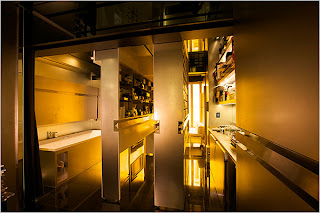
Camper, the Barcelona based shoe company is known for creating high quality coverings for our feet. Beautifully simple in design and using high quality materials has lead to a world renowned reputation. Their store designs have always followed suit – utilizing simple and common materials in new and creative ways. Each store is distinctively different while maintaining a close connection to the brand identity. By keeping the interiors simple it places the shoes front and center as the focal point for all customers - letting the product do the talking while the store becomes a complimentary backdrop.
“Camper shoes have always been shoes that are distinguished by their comfort, their technology, their respect for tradition... and at the same time, the imagination of their design.” In the Berlin store, located on Neue Schönhauser Straße in Mitte, the designers originally developed a concept for a temporary retail space called “Walk in Progress”. They stripped the space down to the bones, white washed the walls while keeping the old wood floor. A simple wooden plank is angled down the center of the space supported by stacks of the iconic Camper shoe boxes, making a bench. Each wall has a similar dark wooden table about a meter deep showcasing the range of styles of shoes – mens to the left, womens to the right. Again these tables are supported by stacked shoe boxes. This concept has the packaging of the product becoming an integral part of the architecture of the store – a structural element of the displays.
The walls have slowly morphed from a clean white surface to a collage of signatures and messages left in red marker by the thousands of shoppers over the past few years. Using the brand's primary color is another simple and playful design idea that gives the customers a voice in the brand's architecture. This idea opens a dialogue between the brand, the store and the customers. The concept has become so loved that the temporary tag has been removed and this design remains as the permanent store.
- - -
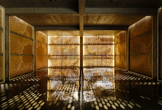
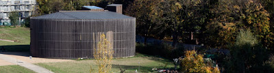
The Chapel of Reconciliation was a politically sensitive project, replacing a large brick church that was destroyed in 1985 because it stood in the zone between the walls. The sensitive resolution is a small elegant chapel built of wood and rammed earth. It doesn't have any insulation and relies on daylight to illuminate the chapel. The plan consists of two ovals one inside the other creating a layered building. This concept is reinforced by the use of natural materials. The outer wall consists of vertical wood planks spanning from the cantilevered roof to the floor slab. Spaced about 6 inches apart they form a unifying facade as well as become a screen that gently reveals the heart of the church inside. There is nothing thermally enclosing the gap between planks which also reinforces a connection between the congregation and the surrounding community and environment. Air freely flows in and out and sunlight casts strong shadows across that streak across the floor and sharply bend up the heavy walls inside.
The inner oval has a slightly shifted axis that aligns with the plan of the previous church. The heavy rammed earth walls also include fragments of the original bricks in the soil mixture. This creates a literal and symbolic connection between the new structure and the historic context of the site. The original altar has also been recovered and reinstalled in an alcove within the rammed earth walls where it originally stood in the previous building. This prayer room relies on a single skylight to illuminate the space. Lighting conditions change as the weather, climate and seasons make their rounds again connecting spirituality with natural forces. There is nothing fancy about this building. It is incredibly simple yet profound in its materiality, symbolism and meaning to its congregation.
Complexity in architecture too often takes precedent over clear concepts and simple execution of creative designs solutions. These projects aren't breaking any ground when it comes to technological innovation. Yet they are both simple to the point of being remarkable. The Camper store playfully utilizes an iconic part of purchasing shoes and morphs it into an integral part of the interior design. The Chapel of Reconciliation on the other hand looks into the past for an ancient technology and gives it a rebirth in todays high tech design world. Both are incredible creative and offers a new approach to contemporary architecture.
This Article was written for MySpace Design Magazine
With so much focus on high tech solutions these days its refreshing to see some elegantly simple designs utilizing low tech approaches. Germany is commonly known for its precise engineering and technological advances in the building industry. Contemporary architecture throughout the country utilizes high-tech solutions to satisfy issues of structure, envelope, materiality and address sustainability. Computer manipulated louvers, rotating sun screens and advanced materials are common among the contemporary buildings in Berlin. However, technology doesn't always lead to great design. In a city renowned for its economic hardships going hand in hand with a thriving art scene, budget constraints can lead to true innovation and creative design solutions. Berlin's reputation stems from the fact it is affordable to live here giving artists the freedom to live a bohemian lifestyle and pursue their creative endeavors.
This inspirational environment has spilled over to the fields of architecture and design as. Two projects in particular demonstrate the creative power of design utilizing low-tech solutions. The Chapel of Reconciliation utilizes rammed earth – one of the world's oldest building materials and techniques – while the Camper store creatively makes use of something as simple as the shoe box.
Camper, the Barcelona based shoe company is known for creating high quality coverings for our feet. Beautifully simple in design and using high quality materials has lead to a world renowned reputation. Their store designs have always followed suit – utilizing simple and common materials in new and creative ways. Each store is distinctively different while maintaining a close connection to the brand identity. By keeping the interiors simple it places the shoes front and center as the focal point for all customers - letting the product do the talking while the store becomes a complimentary backdrop.
“Camper shoes have always been shoes that are distinguished by their comfort, their technology, their respect for tradition... and at the same time, the imagination of their design.” In the Berlin store, located on Neue Schönhauser Straße in Mitte, the designers originally developed a concept for a temporary retail space called “Walk in Progress”. They stripped the space down to the bones, white washed the walls while keeping the old wood floor. A simple wooden plank is angled down the center of the space supported by stacks of the iconic Camper shoe boxes, making a bench. Each wall has a similar dark wooden table about a meter deep showcasing the range of styles of shoes – mens to the left, womens to the right. Again these tables are supported by stacked shoe boxes. This concept has the packaging of the product becoming an integral part of the architecture of the store – a structural element of the displays.
The walls have slowly morphed from a clean white surface to a collage of signatures and messages left in red marker by the thousands of shoppers over the past few years. Using the brand's primary color is another simple and playful design idea that gives the customers a voice in the brand's architecture. This idea opens a dialogue between the brand, the store and the customers. The concept has become so loved that the temporary tag has been removed and this design remains as the permanent store.
- - -
The Chapel of Reconciliation was a politically sensitive project, replacing a large brick church that was destroyed in 1985 because it stood in the zone between the walls. The sensitive resolution is a small elegant chapel built of wood and rammed earth. It doesn't have any insulation and relies on daylight to illuminate the chapel. The plan consists of two ovals one inside the other creating a layered building. This concept is reinforced by the use of natural materials. The outer wall consists of vertical wood planks spanning from the cantilevered roof to the floor slab. Spaced about 6 inches apart they form a unifying facade as well as become a screen that gently reveals the heart of the church inside. There is nothing thermally enclosing the gap between planks which also reinforces a connection between the congregation and the surrounding community and environment. Air freely flows in and out and sunlight casts strong shadows across that streak across the floor and sharply bend up the heavy walls inside.
The inner oval has a slightly shifted axis that aligns with the plan of the previous church. The heavy rammed earth walls also include fragments of the original bricks in the soil mixture. This creates a literal and symbolic connection between the new structure and the historic context of the site. The original altar has also been recovered and reinstalled in an alcove within the rammed earth walls where it originally stood in the previous building. This prayer room relies on a single skylight to illuminate the space. Lighting conditions change as the weather, climate and seasons make their rounds again connecting spirituality with natural forces. There is nothing fancy about this building. It is incredibly simple yet profound in its materiality, symbolism and meaning to its congregation.
Complexity in architecture too often takes precedent over clear concepts and simple execution of creative designs solutions. These projects aren't breaking any ground when it comes to technological innovation. Yet they are both simple to the point of being remarkable. The Camper store playfully utilizes an iconic part of purchasing shoes and morphs it into an integral part of the interior design. The Chapel of Reconciliation on the other hand looks into the past for an ancient technology and gives it a rebirth in todays high tech design world. Both are incredible creative and offers a new approach to contemporary architecture.